

The Sleep/Awake project explores the relationship between movement and awareness. I became interested in this concept when taking a walk in Albert Park at Auckland city. I began to notice how easily my mind would drift and my body would move around the park as if I was in autopilot. Only when I was struck with an eye-catching flower display or came across a bandstand, I would become entuned with my surroundings again and explore the park.
I find that in the current state of the world, there is a large disconnect with oneself, each other and our surroundings. Being absent minded can drive you to lose sight of the present, moreover you lose curiosity, creativity and connection. In extreme measures, it can make you feel lonely, anxious as you start to live in your heard and you lose appreciation for what surrounds you. This is why I wanted to make a project that encouraged awareness and allowed people to connect to their environment in a curious and playful manner.
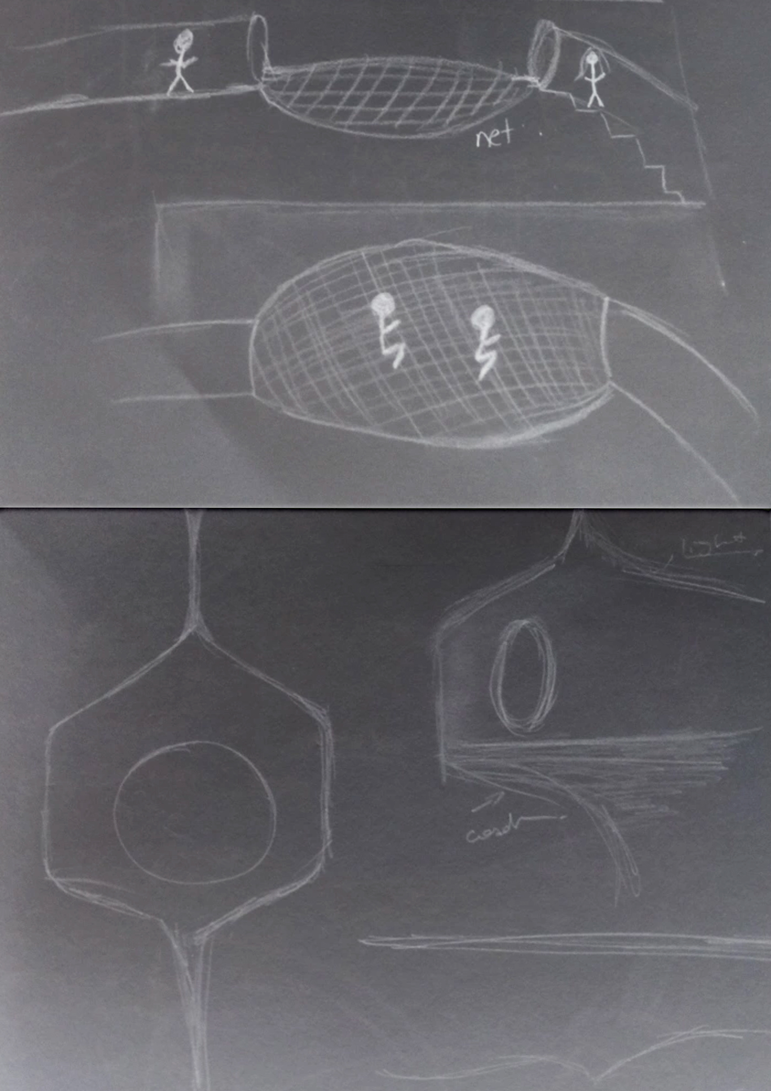
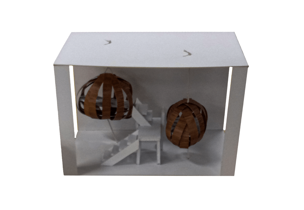
I designed a temporary living space in St Paul St galleries (gallery three) where 2 strangers (musicians) would share the space for 2 to 3 days. I filled the majority of the space with a large-scale tunnel system, that leads people into both extremes of the gallery room. One extreme leaving them close to the dining area and the other extreme leaving them close to the sleeping pods.
There is still space in the gallery for the two strangers to move outside of the tunnels. This was done deliberately as I wanted them to be presented with a choice of pathways. I believe that having options on different pathways would help inspire curiosity and a sense of exploration, and hopefully the two strangers would become more present in their surroundings. Turning off the autopilot mode that most people have on when moving through their day.
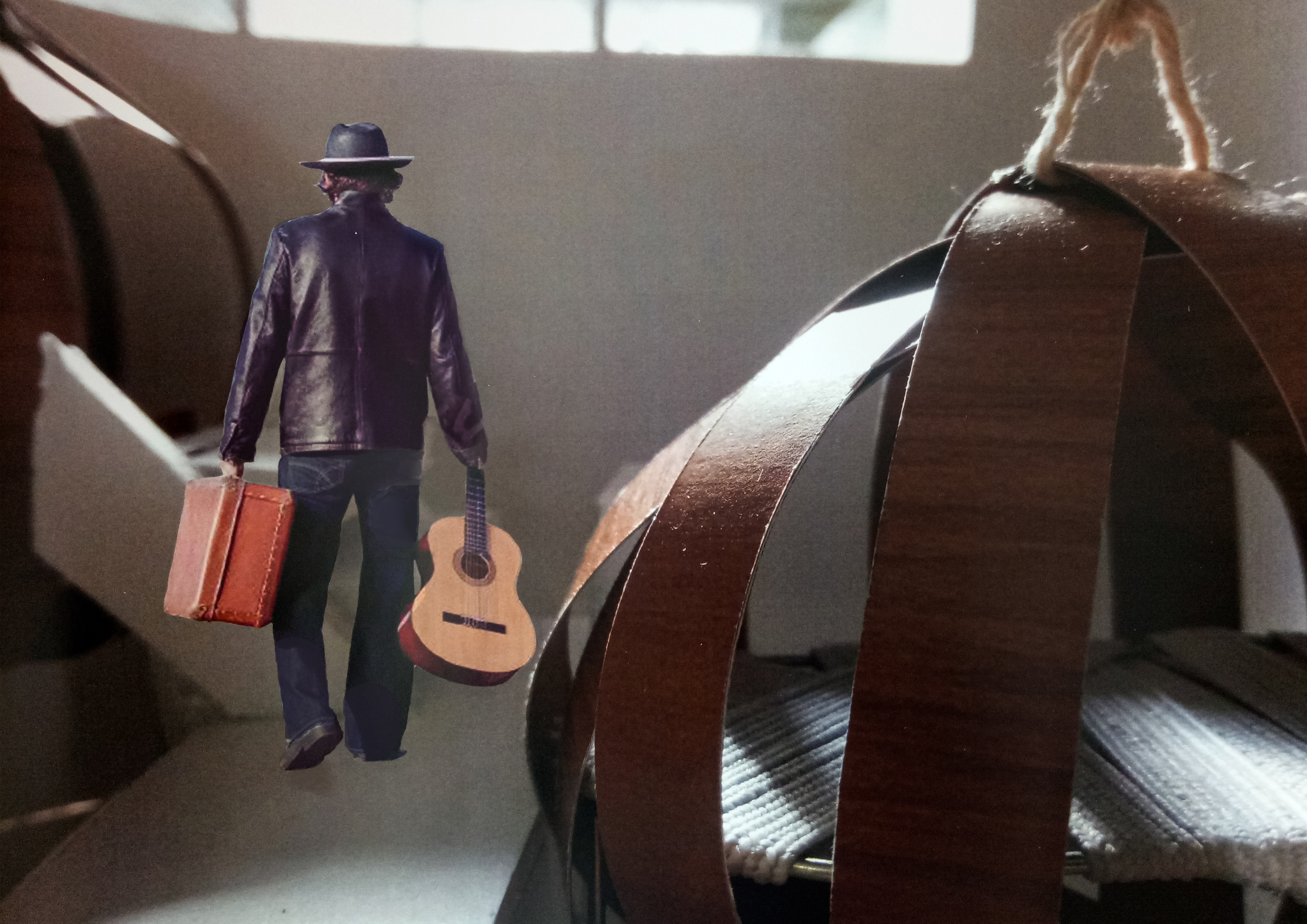
I chose two musicians to share this unique space because I was intrigued to see how they would interact with it. Which places would they choose when making music? Would they take advantage of the different echoes created by the different areas of the gallery space? I wanted to know how two creative minds would work with the space.
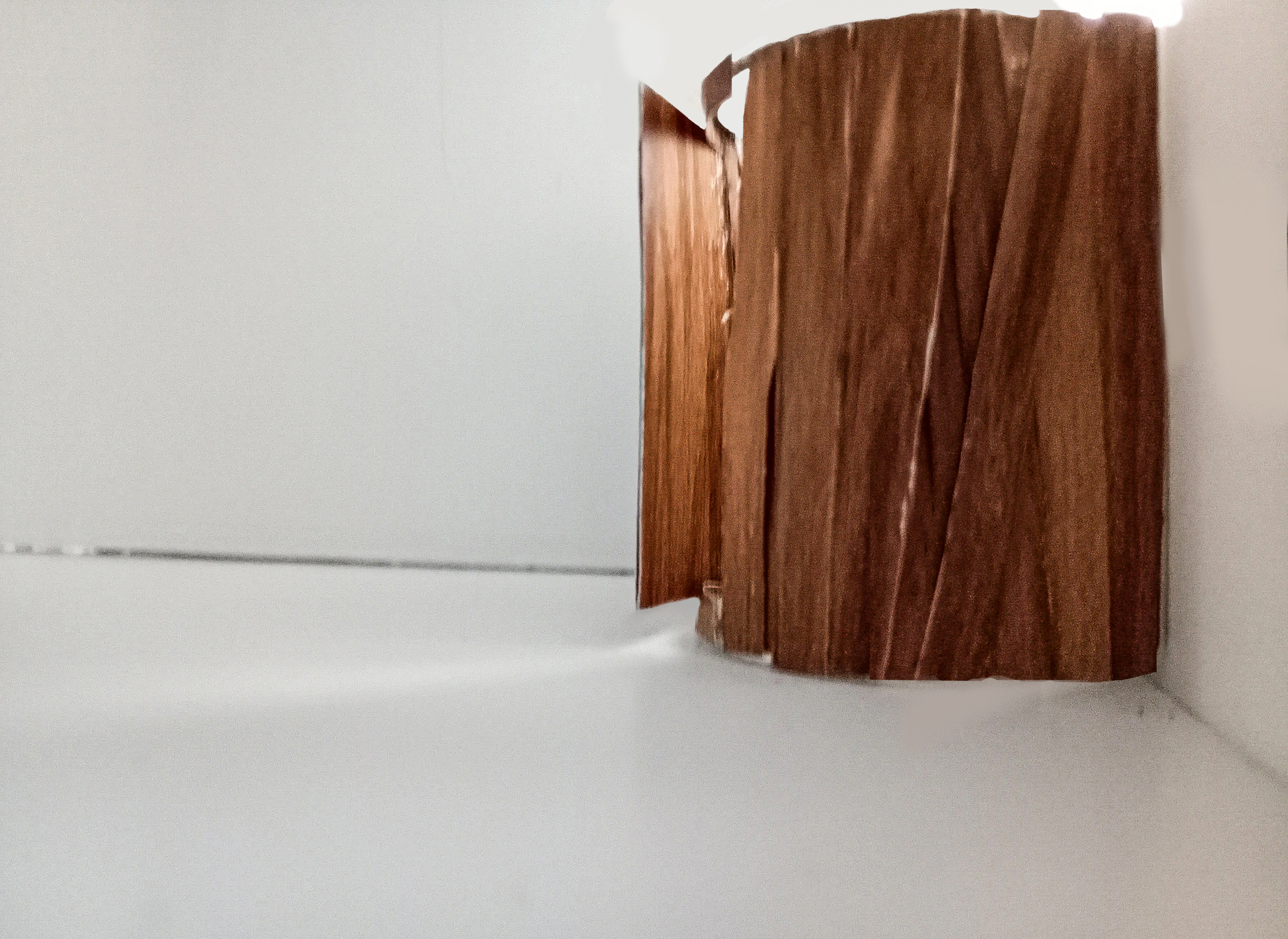
The entrance to the gallery was fashioned in a way that there could only be on entrance point and one exit point. At the entrance point you are greeted with the tunnel’s large open mouth, a confronting sight at first glance. However, it is an invitation to push through any initial hesitation to enter unknown territory, to let fear aside and let curiosity lead you forward.
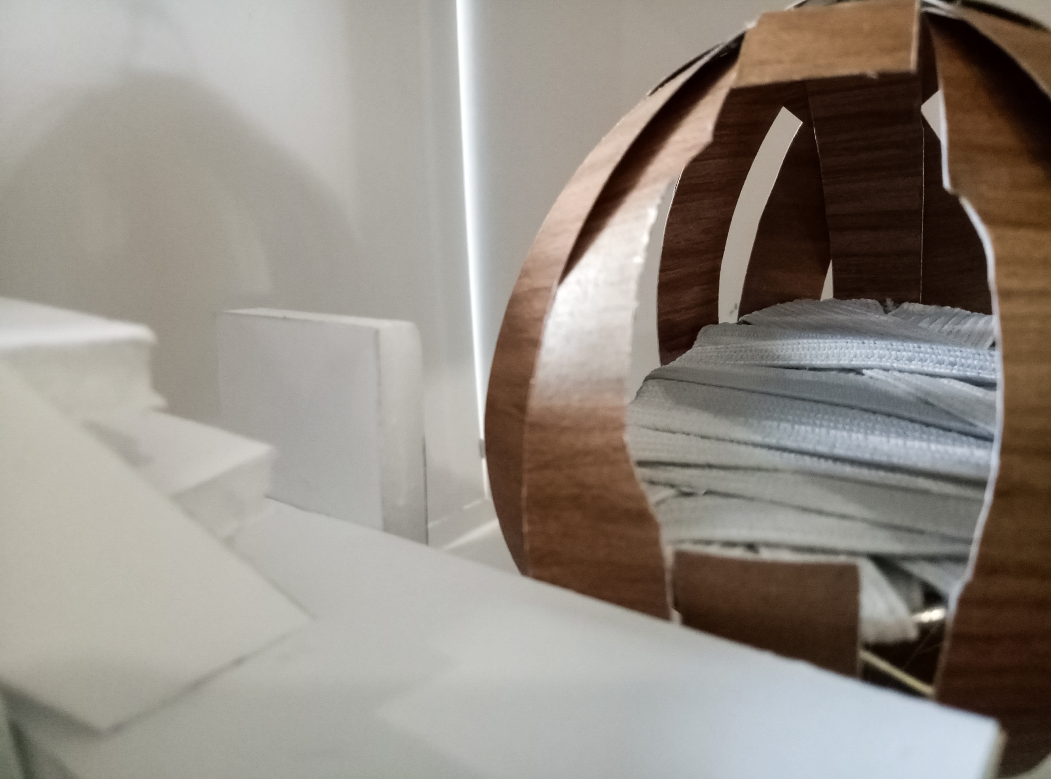
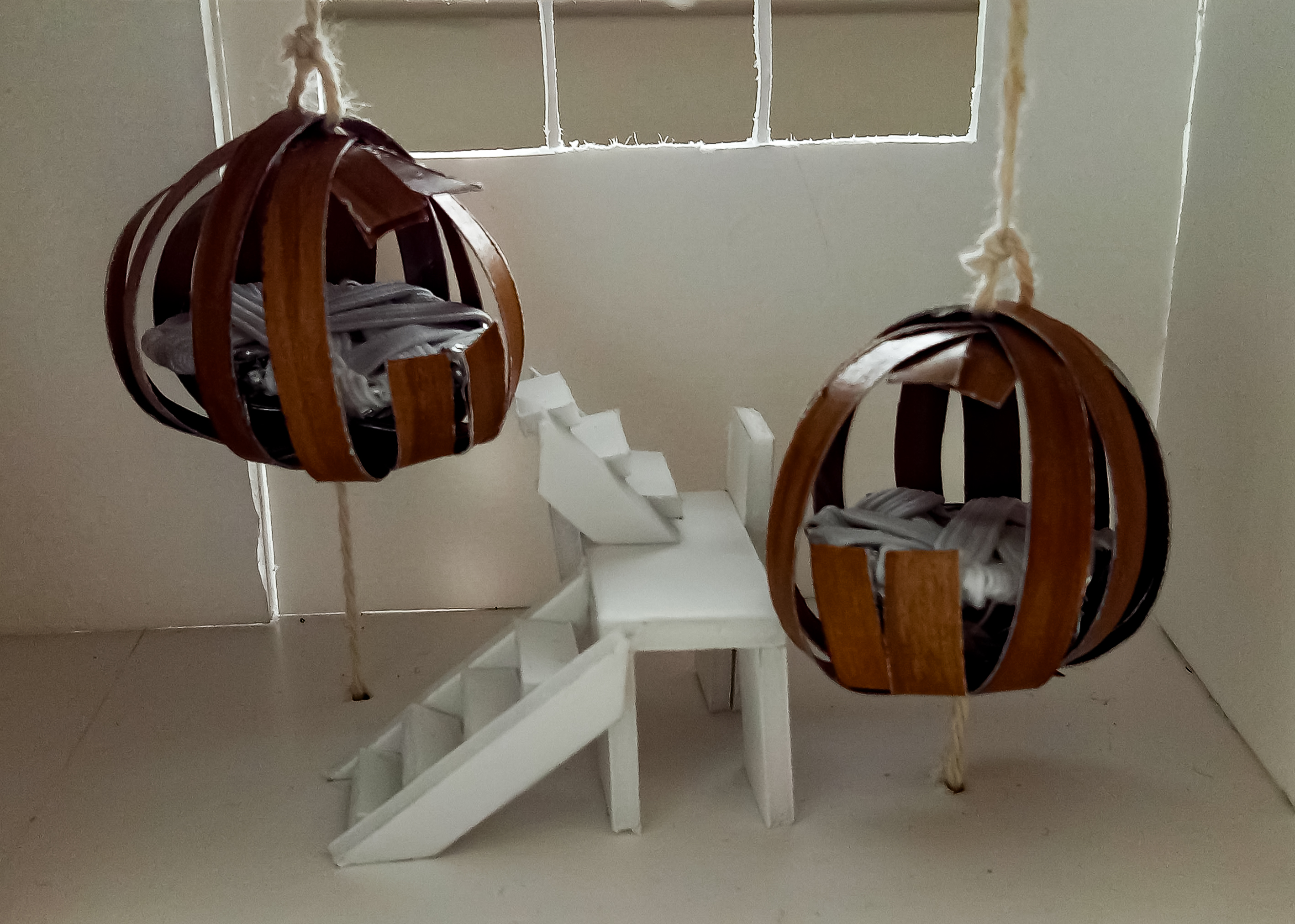
With the same intention behind the tunnels of brining awareness to the here and now, I purposefully designed the musician’s beds as elevated pod-like structures. Another striking sight to jolt them back into present.


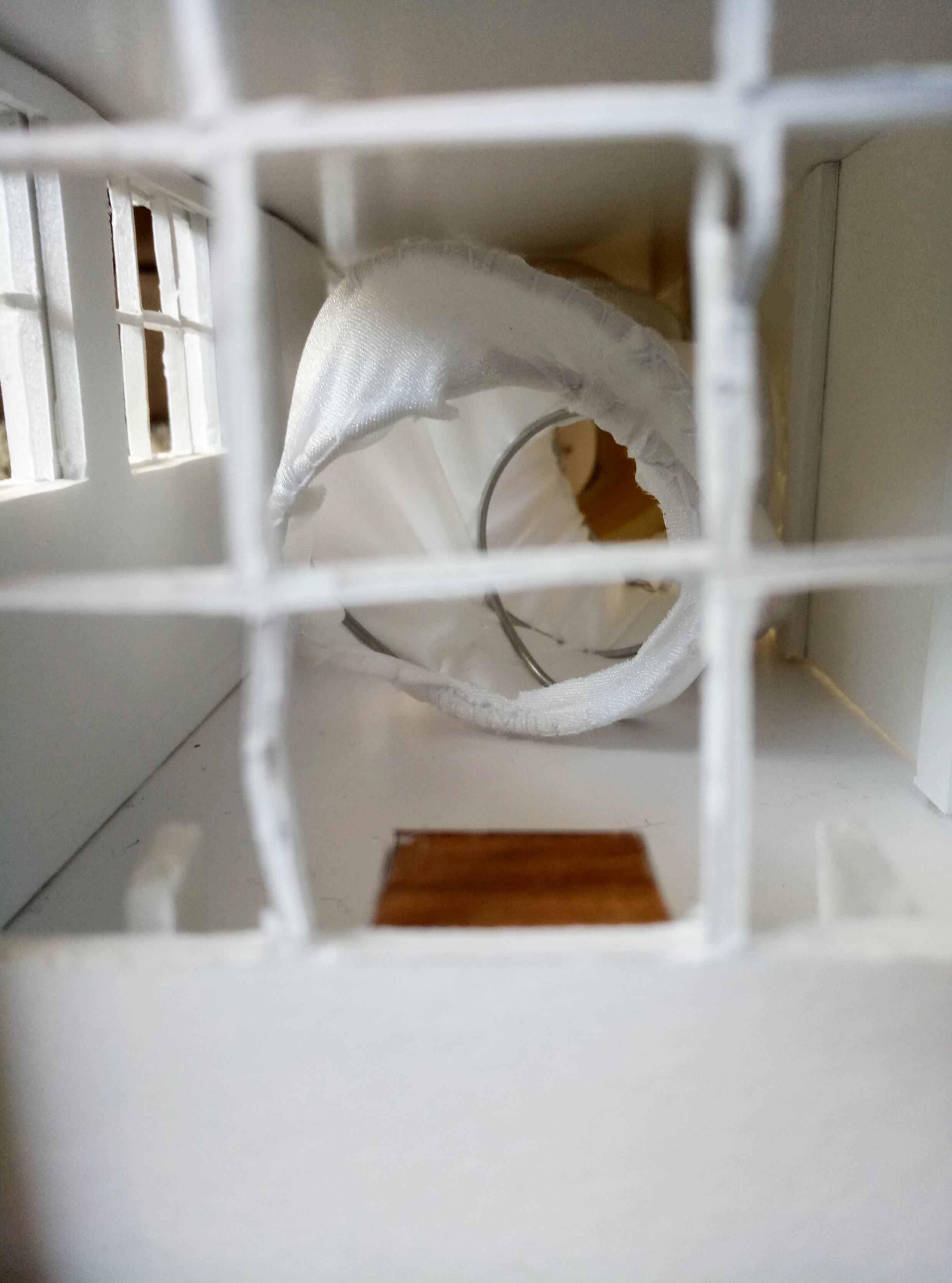
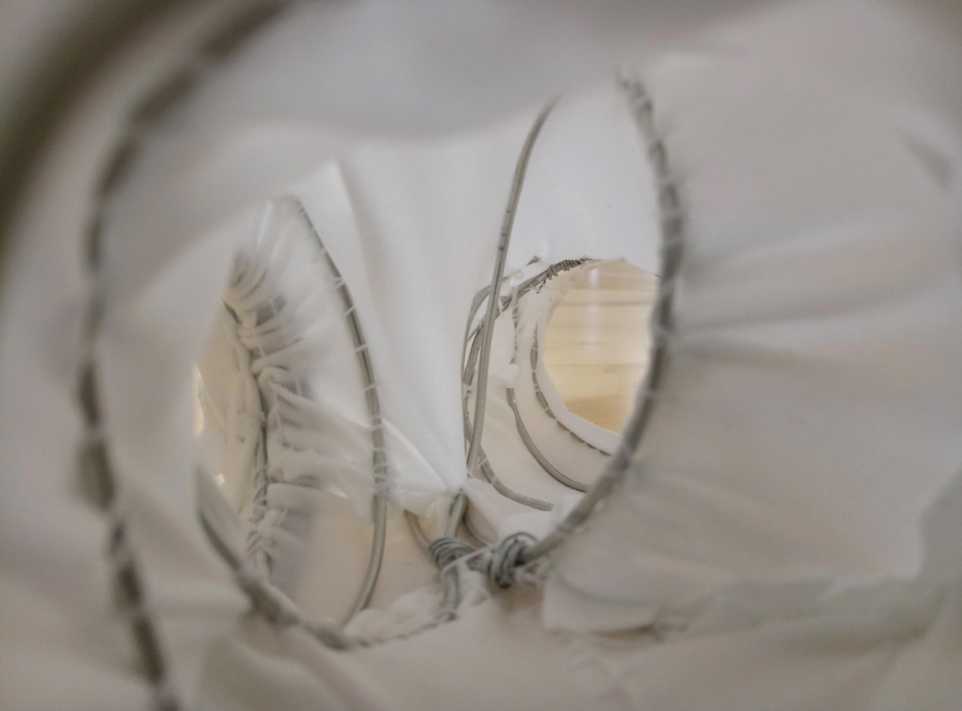
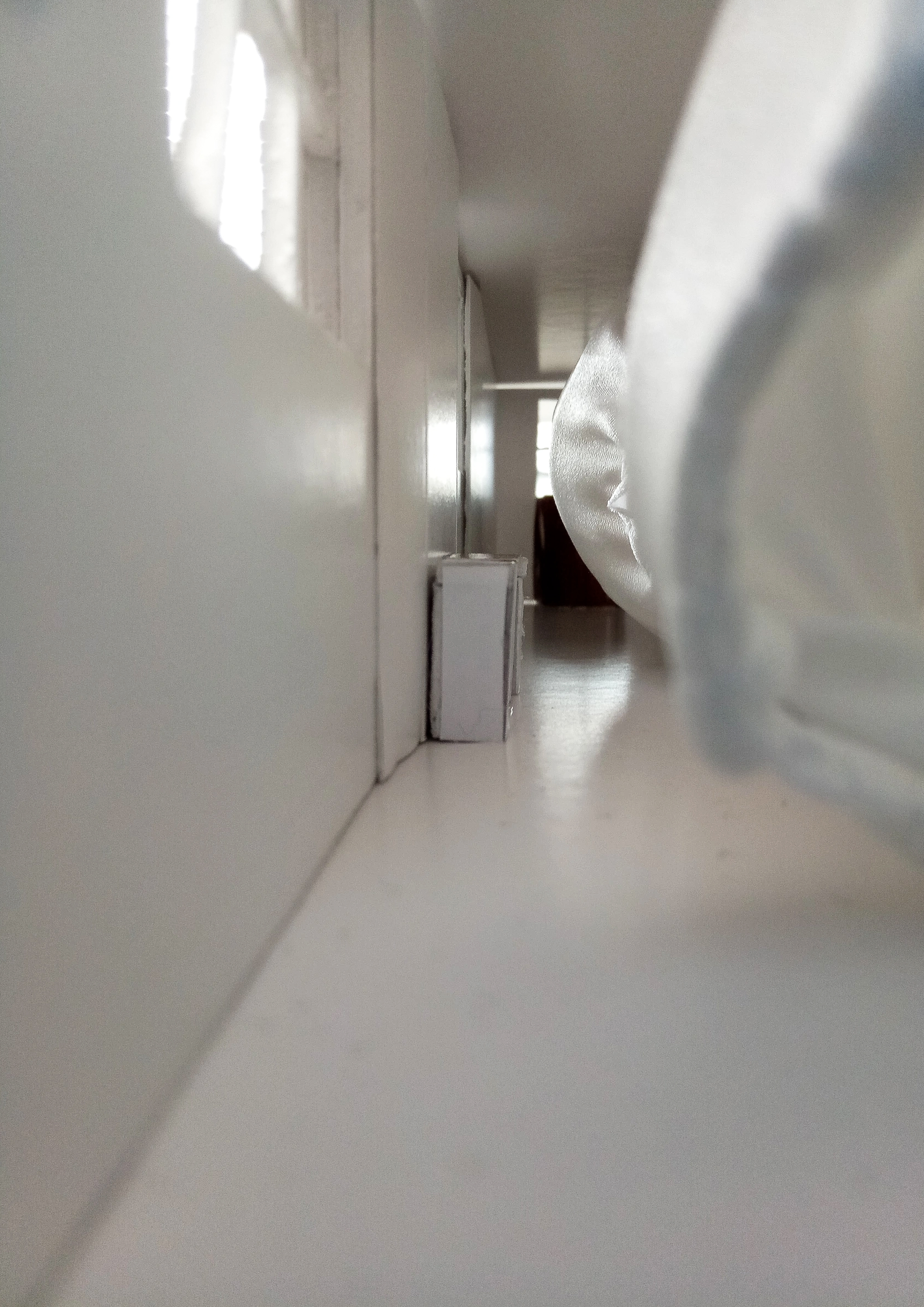
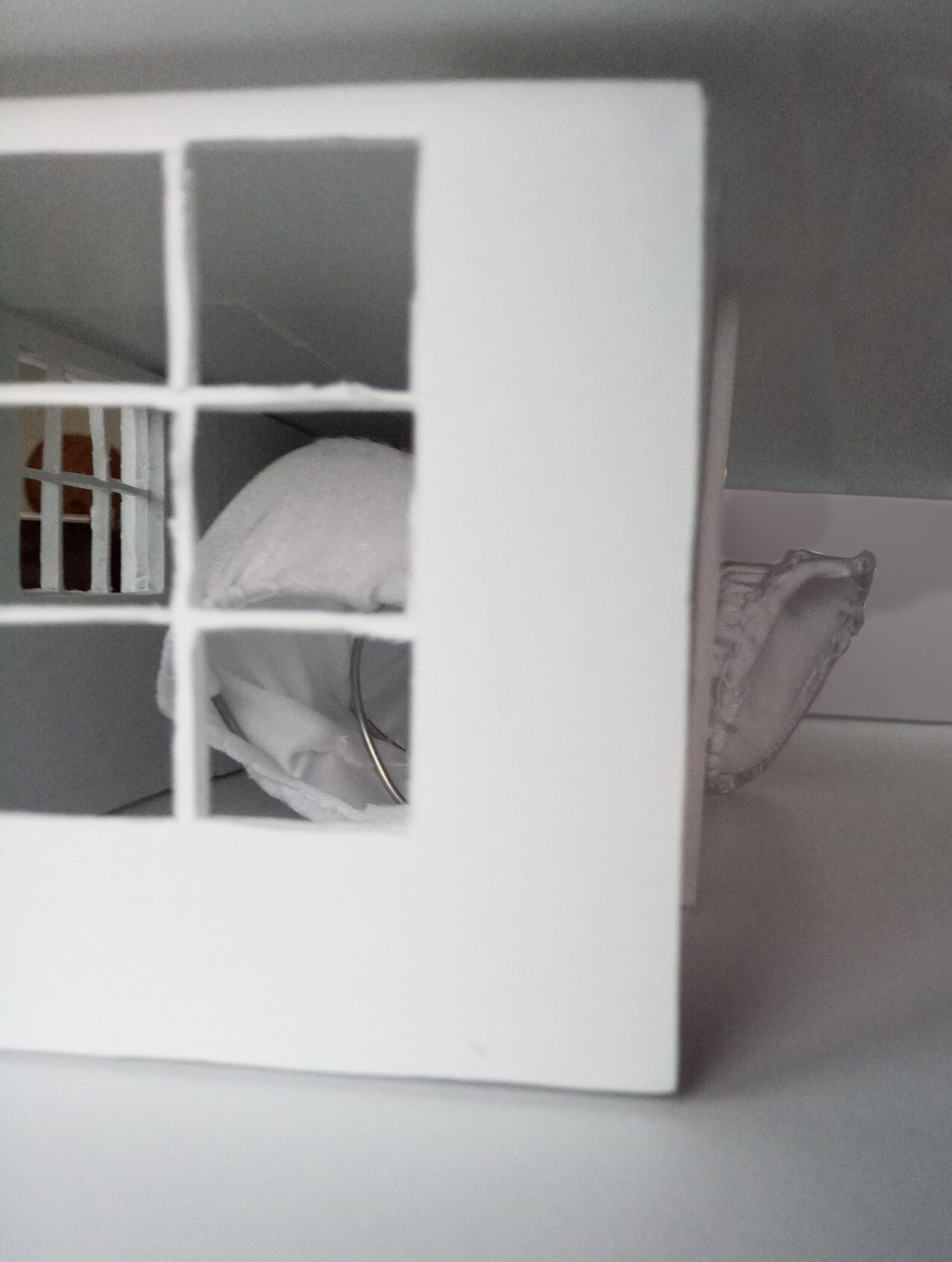
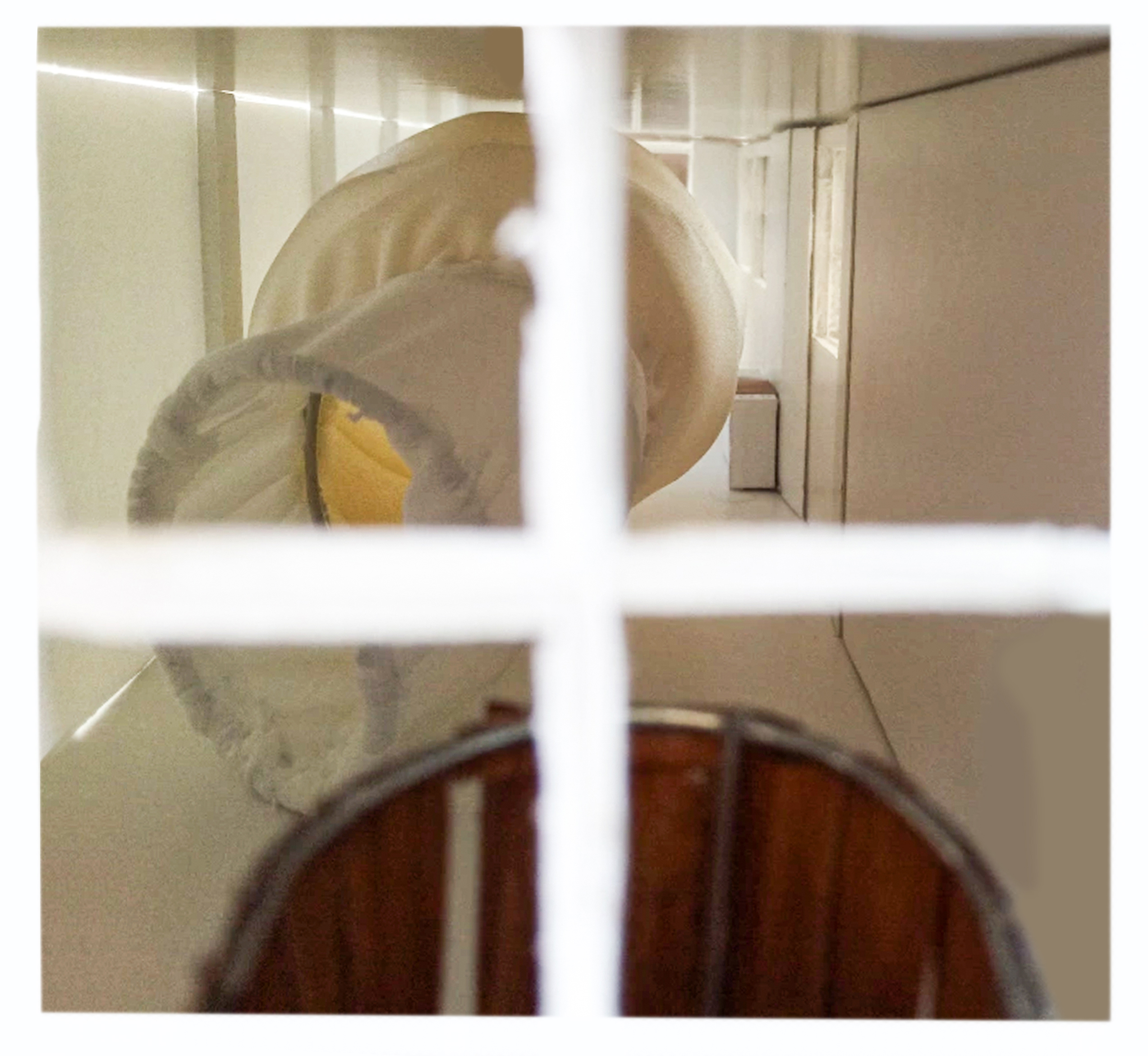
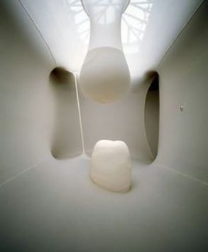
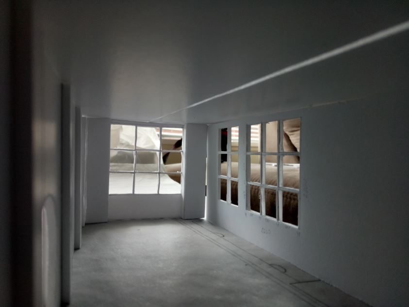
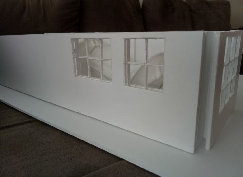
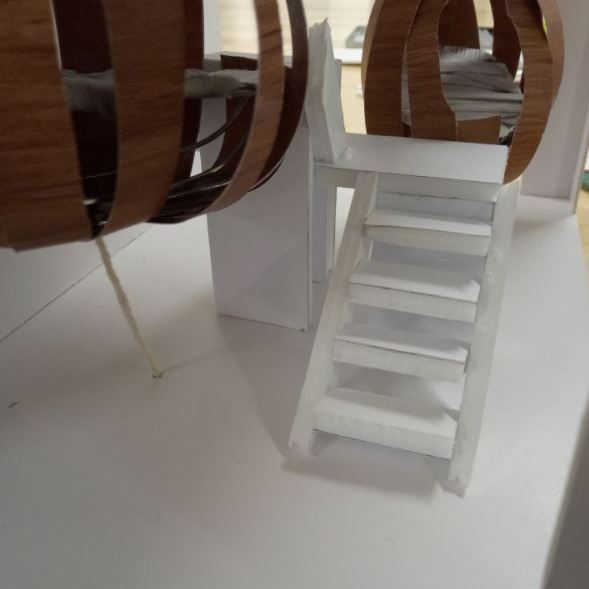
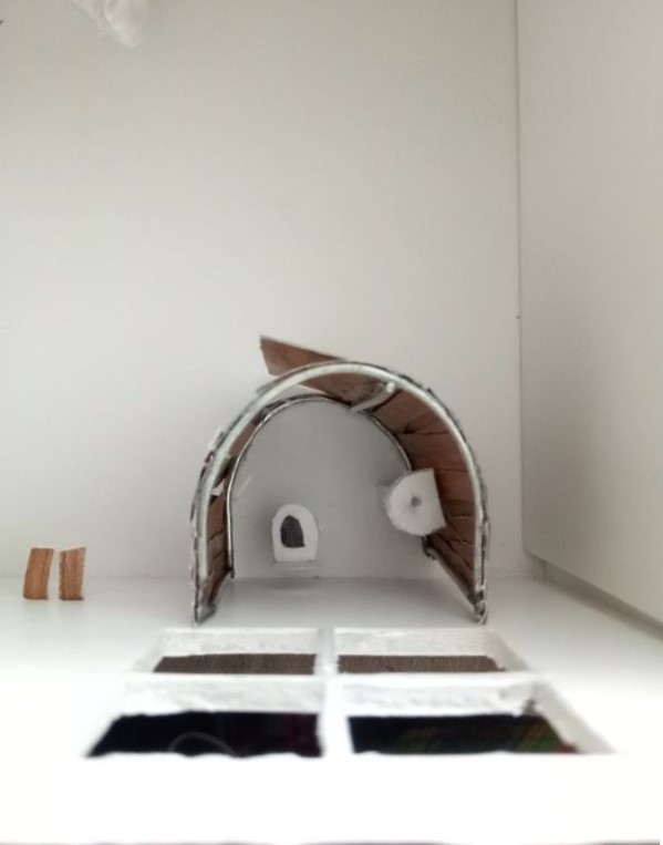
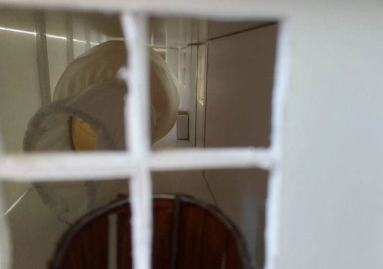
These atmospheric images provide a more in-depth view of what the two strangers would see moving through the gallery space. All the images were taken using a 1:50 scale handcrafted model I made.
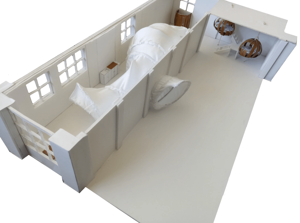
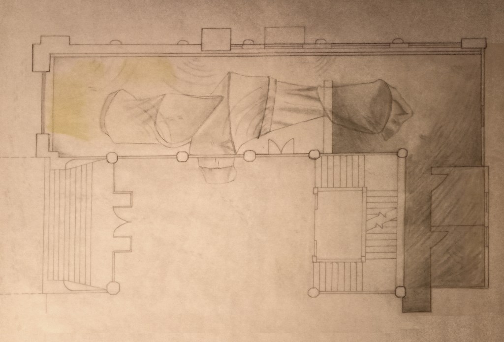
Bellow are two A1 plans that show a Top view and a Section view of my project. The Top view plan shows everything that you can find within the gallery space, it also gives an overview of how the gallery functions. I also show how light enters the gallery space and it how it illuminates certain areas inside while leaving others in the shade represented by patches of light and darkness in the image below.
The Section 1 plan below shows the inside of the gallery from a side view perspective. I did this because it best displayed the sleeping pods and the scale of the tunnels while positioning my project in relationship to the outside world.

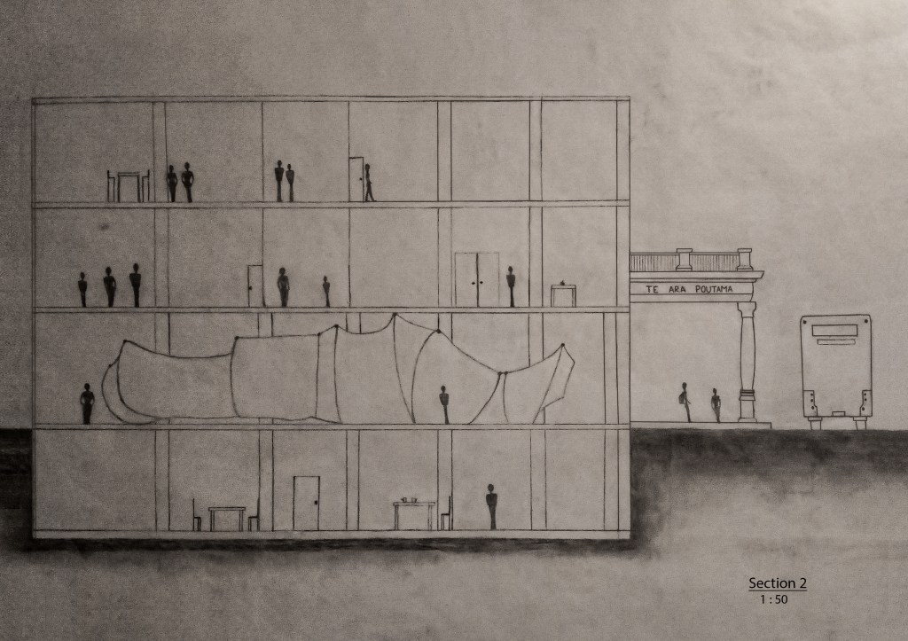
Below is the second Section plan, it mainly focuses on showing the different proportions of the tunnel inside the gallery. This specific viewpoint better positions the project within the context of the broader city space, specifically next to High Street in Auckland CBD.

For my A1 site plan, I show a shift between Auckland city landmarks which slowly move towards the inside of the St Paul St galleries (gallery three). It was very important for me to express the busyness and overwhelming feeling one has in the city. I wanted people to understand how in my gallery site, the two strangers would be slowly detaching themselves from this environment and entering a space that feels more focused and peaceful. They are separating themselves from fast the paced city environment to hopefully find new perspective and creativity.
Process Work
I began to analyse my own sleeping experience. I started to pay close attention to the noises I heard before falling asleep, like the crickets outside my bedroom window and the snores coming from my sister! I also began to realise how I wanted the environment around me to feel sheltered. This became more apparent to as I always make sure my bedroom door is shut closed, otherwise, I cannot sleep. The way my duvet covers hug me and my head sinks deeper onto my pillow, these all-encompassing feeling I get is crucial to me. My experience of going to sleep strongly reminded me of a cocoon because of the feeling of being enveloped in a safe and comfortable atmosphere is a must for my sleep.
Waking up the next morning felt like coming out of a deep tunnel. My surroundings were not fully clear to me, my loud alarm ringed by my ear as I lay in bed trying to fully grasp onto reality. The bright sunlight sneaked through my curtains and I could hear the birds singing outside my window. My sleep/awake experience reminded me of being drawn into an engulfing passageway in where the only way out is by continuing to fall into it and only then being able to get to the other side of alertness.

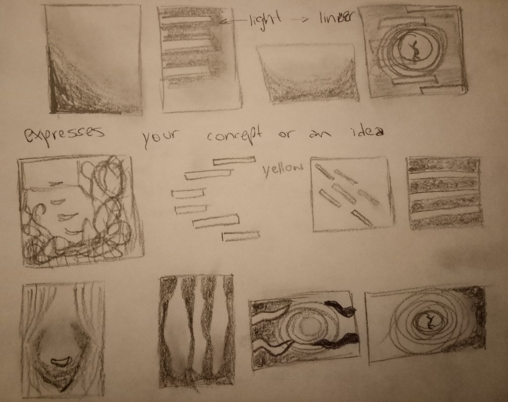
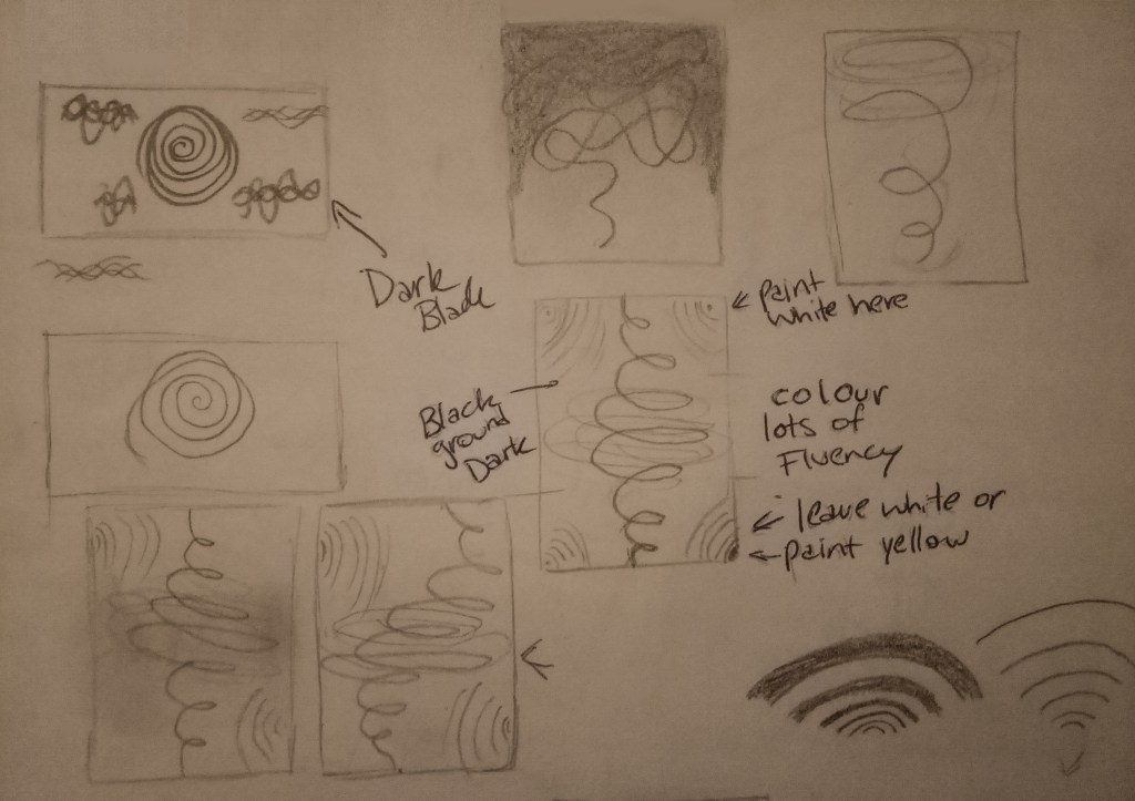
Exploring these contrasting thresholds allows me to visualise my sleep/awake state. Above are the sketch drawings I made exploring the thresholds, these sketches were crucial for finalising the A2 painting.
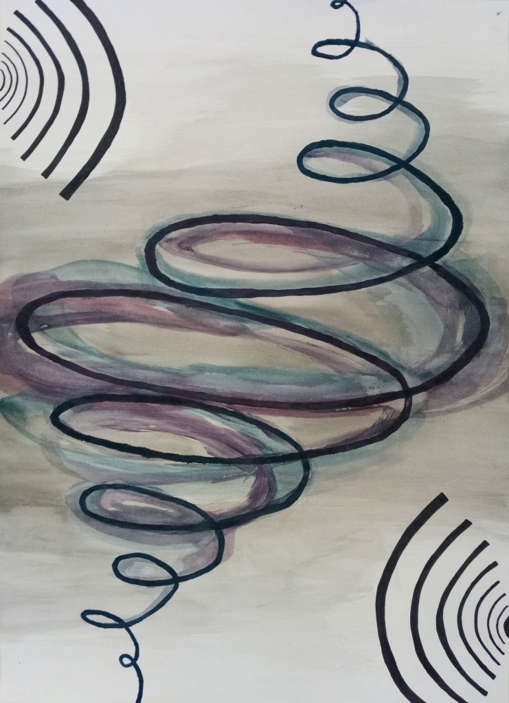
This A2 painting is the final painting that expresses my own sleeping and awaking experience .
The spiral starts small and controlled and as I descend into sleep (into darkness) it gets bigger and less tamed, to show how my mind is free to move and be lost in a senseless sleep. I chose to further specify this feeling by using the colours blue and purple, to me they best represent a dream like state. I applied them lightly with a water wash to best create a sense of fluency.
The vibrating lines protruding on either side of the center spiral were drawn with black marker to create a sharp contrast to the soft dream like state of the large spiral. The vibrating lines best show how disruptive they are to my own sleep state and it represents the noises of my phone alarm and snores of my sister.
Models
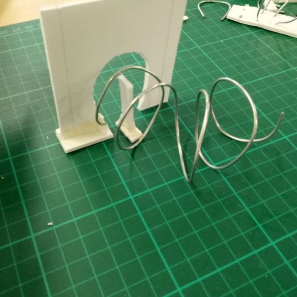
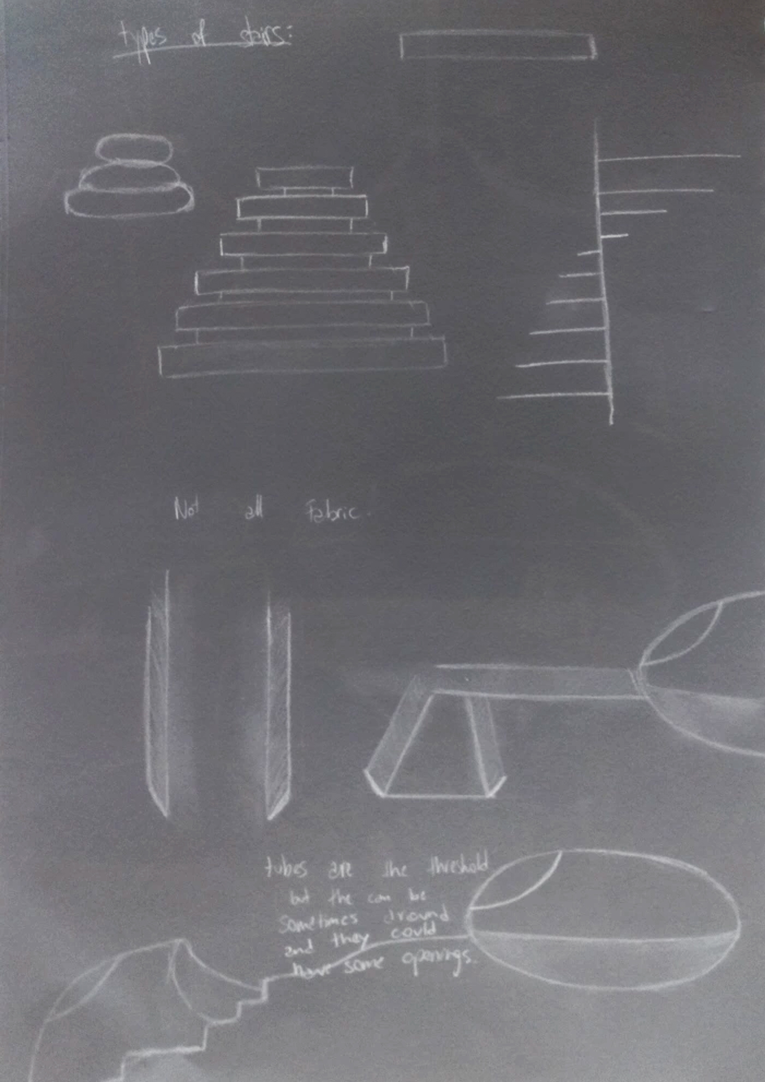
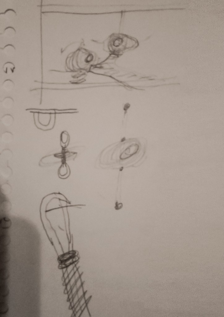
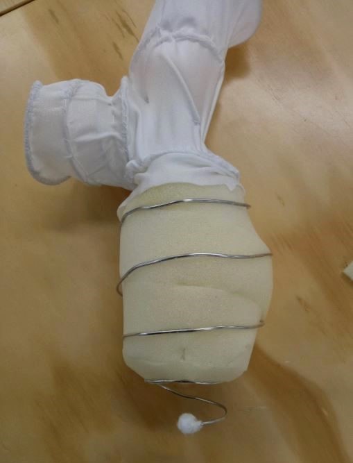
We were asked to develop small models while keeping in mind our selected thresholds: Light/Darkness, Interior/Exterior, Weight/Weightless and Fluidity/Solidity. To be more inventive with the models we had to make, we were told not to use any commonly binding materials such as glue or tape. I used a mixture of metal wire, rope, paper, ribbons, thread and pieces of fabric to make my models. I created 4 to 6 miniature models that I then placed along a grid line, this way I could evaluate how each model compared to the thresholds and see which ones embodied them the best.

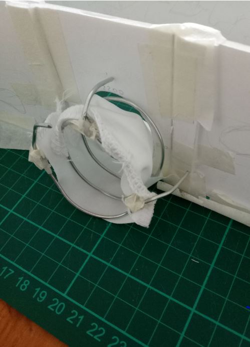
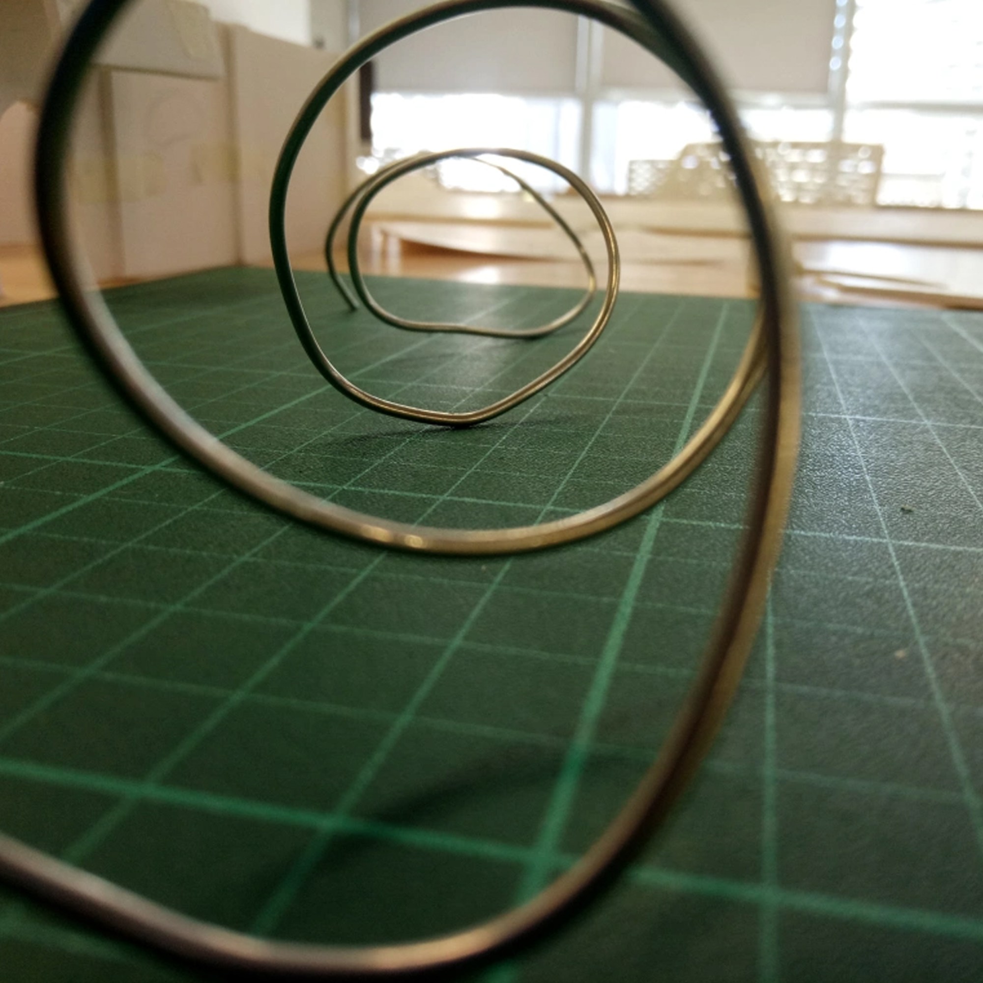
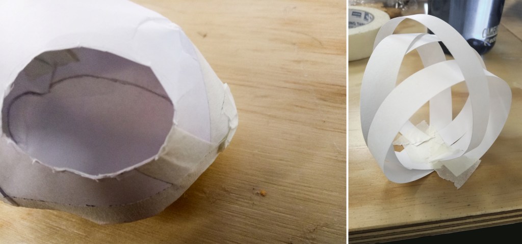
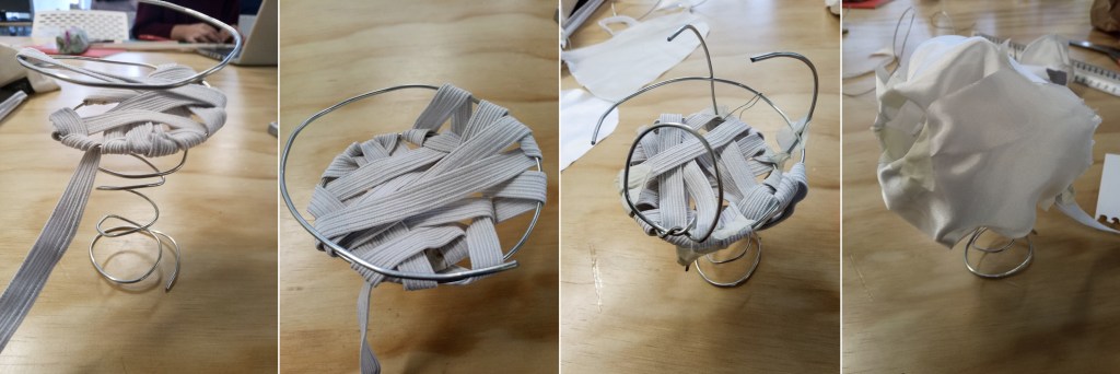
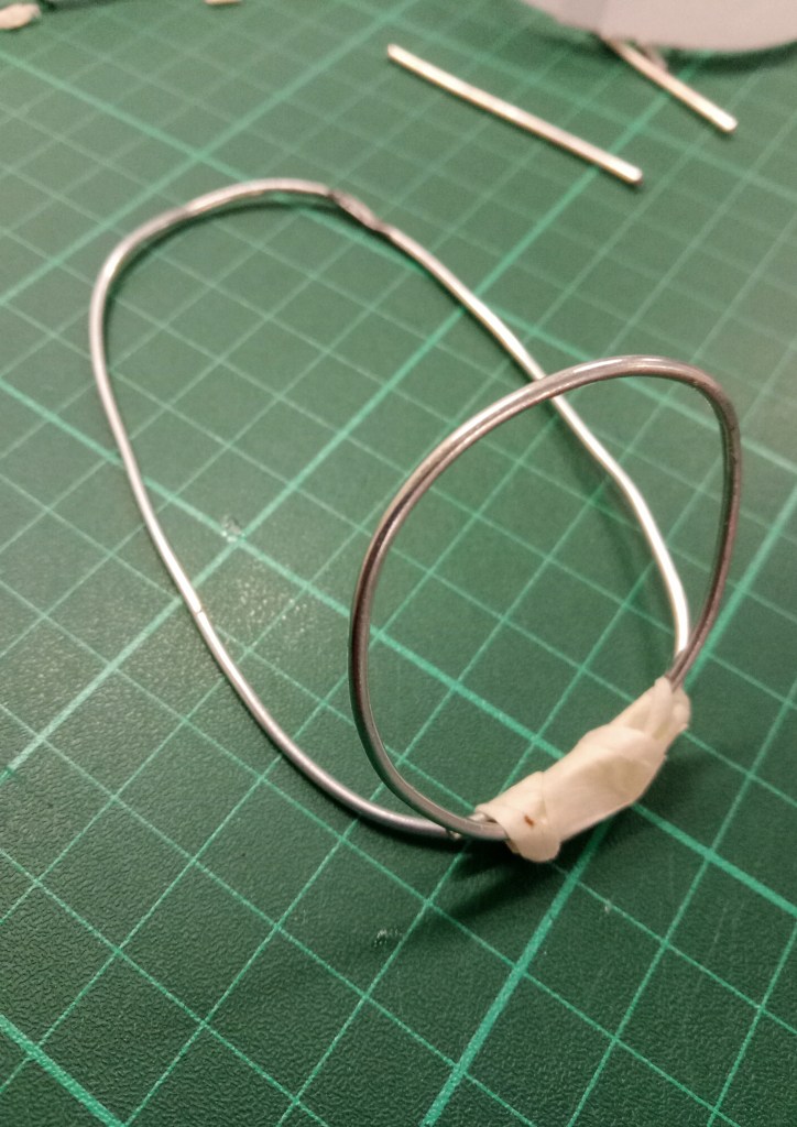
I selected 4 of my favourite models and studied their materiality to understand what effects certain material combinations have. The model I made using paper and metal wire had a harsh contrast, it was striking and dramatic. But it was difficult making them flow together as the metal easily damages the paper. For this reason, I did not continue with this material combination. The model made with paper and rope turned out to be a more flexible combo as the two materials worked together more easily and the paper could curve and hold artful figures. The aluminium model dangling in the air captivated my curiosity and I began to realize that having a moment of suspension in my final model could convey the separate world I am in when unconscious. The spiraling metal model reflected my original experience of falling asleep as it draws people in.

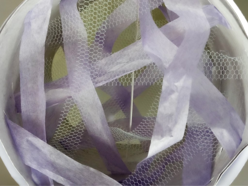
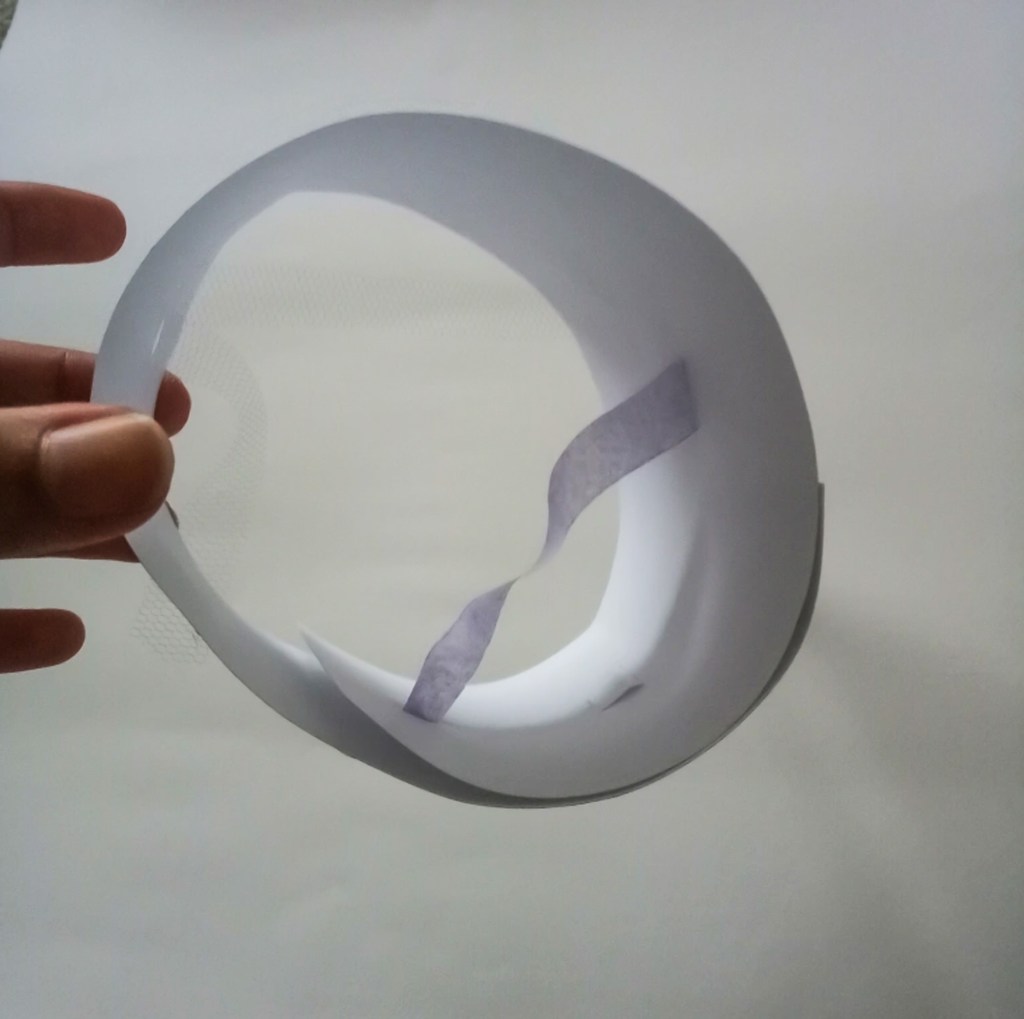
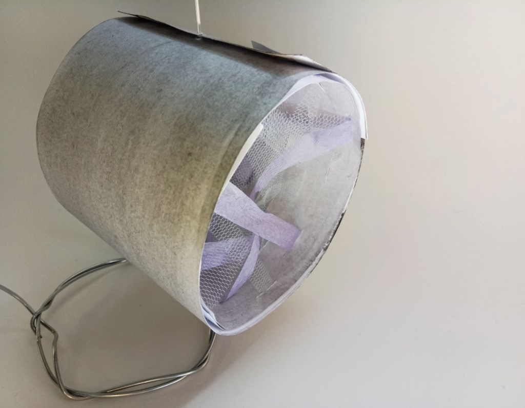
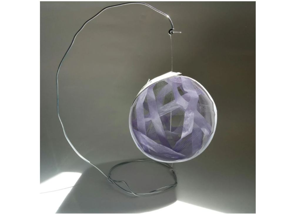
My final model consisted of a large curved metal wire frame, I was inspired by the shape of a baby’s bouncy chair. The main body of the model is a wide tube-like frame made of two layers of paper. The first layer of paper I made small cuts throughout, this way I could thread pieces of blue chiffon and lilac tissue paper. I personally associate a dream-like state to these two colours. As I layered these two fine materials a soft web pattern formed, anyone who examined the model would instantly be drawn inside. I specifically left a small gap in the middle of the web pattern to create a tunnel affect. I finished the circular model with another layer of paper, this way it covered the cuts seen on the other piece of paper. I was able to suspend my circular model by attaching a guitar string through it and fastening the cord to the top of my hanging wire and the circular base. By pulling the string as tightly as I could the string had tension and was able to provide some type of noise.
I view the guitar string that goes through the circular part of the model as the representation of my own mind. The exposed string represents my fully aware/awake state but as it travels through the center of the model it enters a private and boundless space of unconsciousness. The inside of the tunnel can only be seen when the model is seating in a specific angle, it provides a sense intimacy.
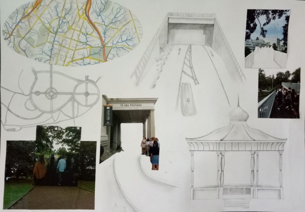
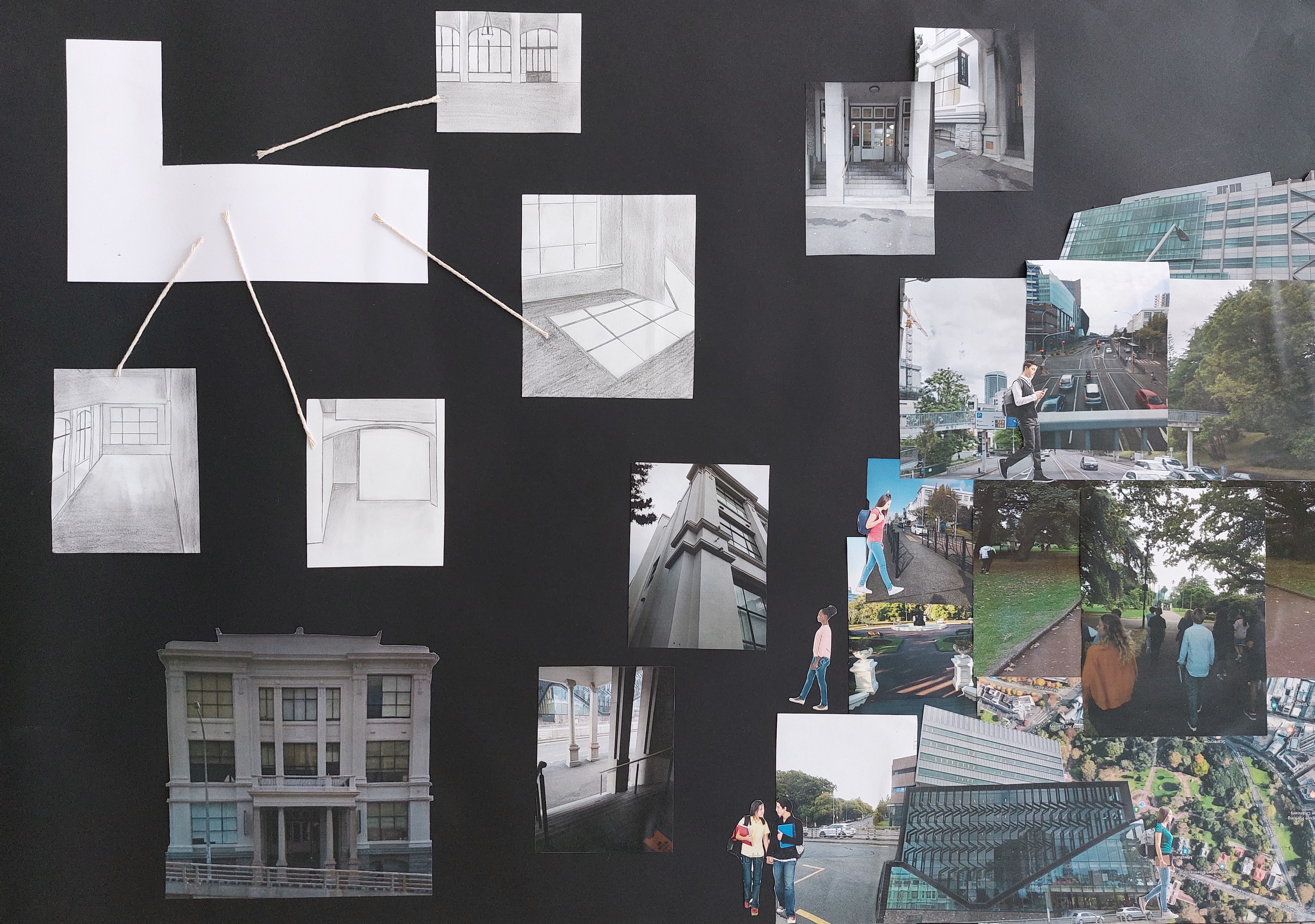
With my class we took a walk from Albert Park in Auckland city towards the St gallery three (the building that we based our design projects on). During this walk we were encouraged to take in the scenery around us and notice how the space aligned with our threshold concepts. We had to evaluate what made an environment an Interior or an Exterior space. I took pictures and drew sketches of the moments that took my interest and of when the scenery altered.
I later made a site map from the recorded images I took during my walk. In this site map I focused on a new threshold relationship; Movement and the use of Shelter. My observations during the class outing led me to take a big interest on the way that outside spaces can still provide cover and a sense of protection. I was also interested with the man-made pathways around Albert Park, I felt the intentional manoeuvring introduced in natural spaces could take away people’s sense of exploration. Both of these two concepts were something I wanted to explore further.
Internal site environment
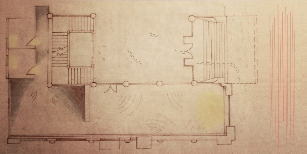
It was time to examine every existing aspect of St Paul gallery site. Once I measured every corner of the gallery, I drew an A1 size floor plan. On a separate piece of butter paper, I began to draw down the different atmospheric attributes of the site.
Such as the light/shadow quality inside the gallery, the foot traffic of the site and its surroundings and where sound is most amplified inside the gallery space.
Developing entrance and tunnel model
I began to look for design inspirations and came across an installation by Sophia Chang called Suspense. She made a web-like system made from stretchy fabric that completely surrounded the existing space. The way she used a fine barrier to separate the interior to the exterior was something that took my interest.
I started to develop ideas for an entrance, I originally thought about having a large tunnel coming out from the St Paul gallery laying across the main foyer of that floor and have it extend to the streets of Wellesley Street E. There people would enter from the street directly to the gallery space but although I liked the tunnel idea, when discussing this idea with my teachers it was brought to my attention that it could be constricting for the people using that common space every day.
Thinking about another alternative for an entrance I knew that having a tunnel/tube effect was something I wanted to keep. I came across a work from Anish Kapoor called Dirty corner (2011) Kapoor has elongated a long tube made of metal. I found the uncertainty of not seeing the other end of the tube to be a true act of trust. I opted with having an open-mouthed tunnel peeking out of the gallery and when entered people will have 2 pathways to choose from. This way they are momentarily lost and curious of their surroundings.
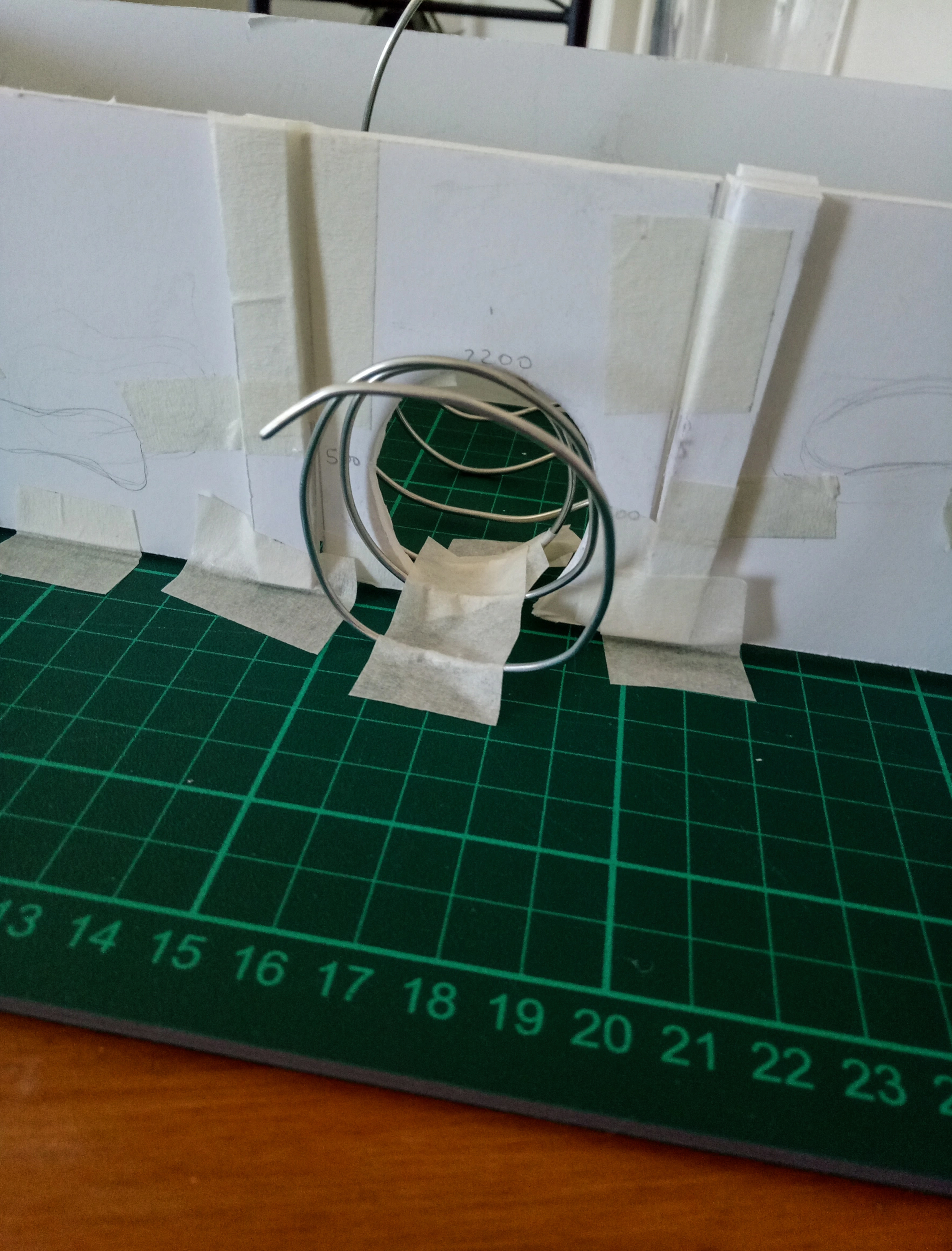
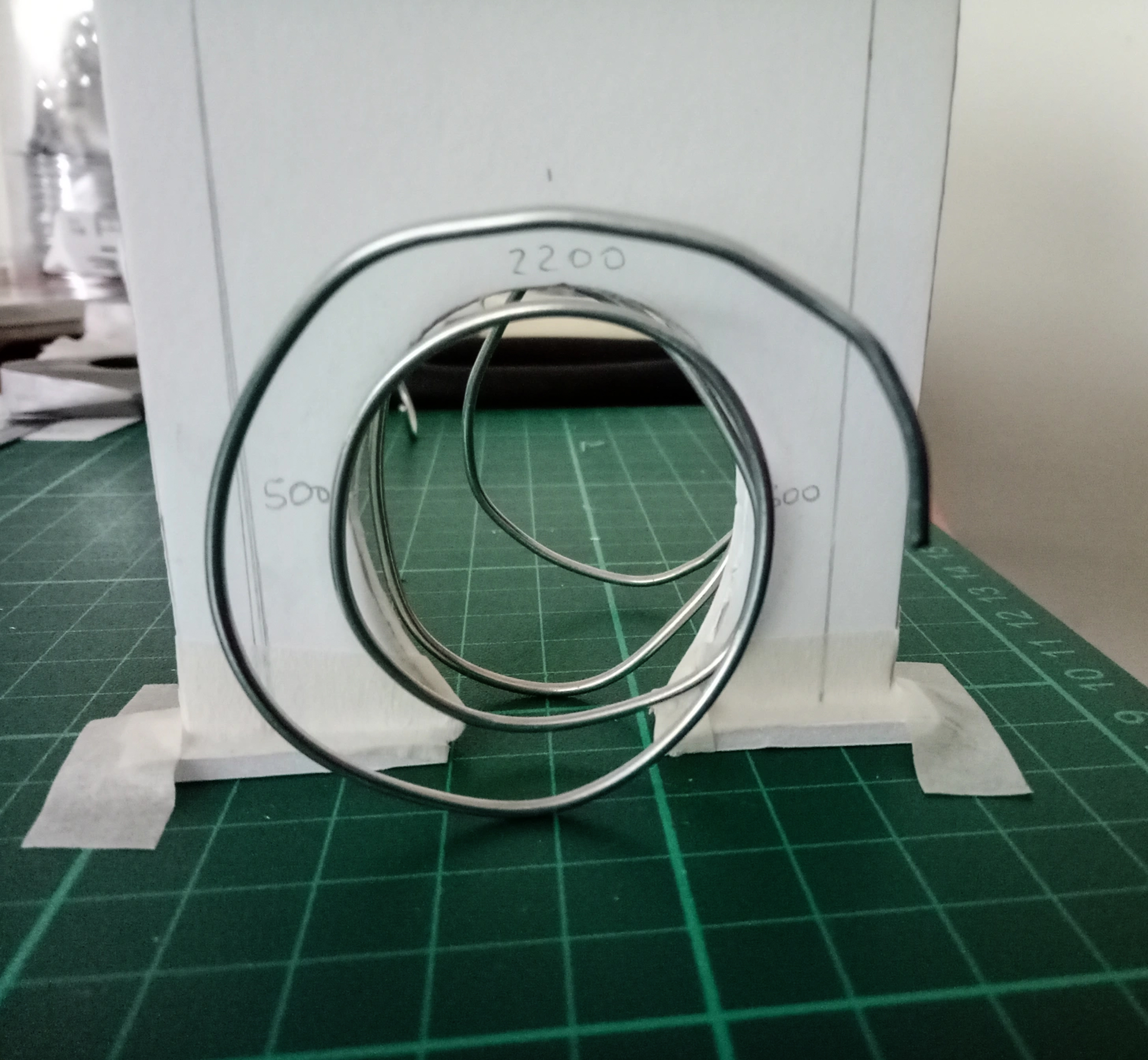


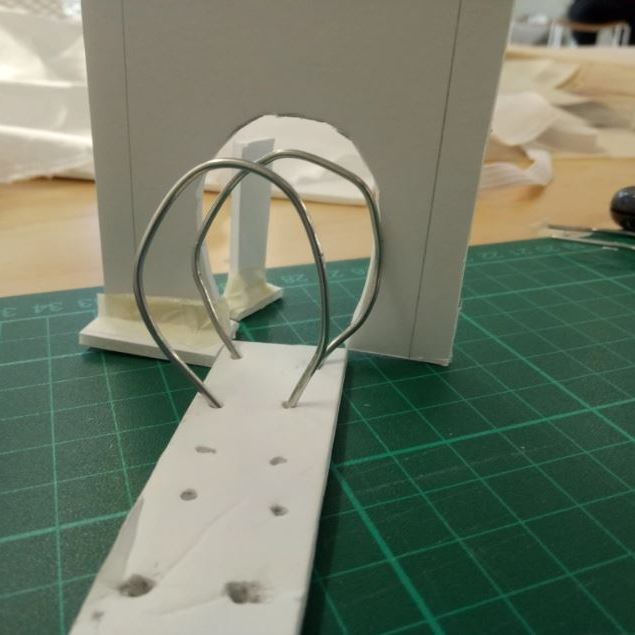
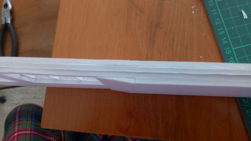
I began to test different tunnel shapes but ultimately found having a continuous spiral was most affective as I could manipulate the shapes better and it was able to hold itself upright.
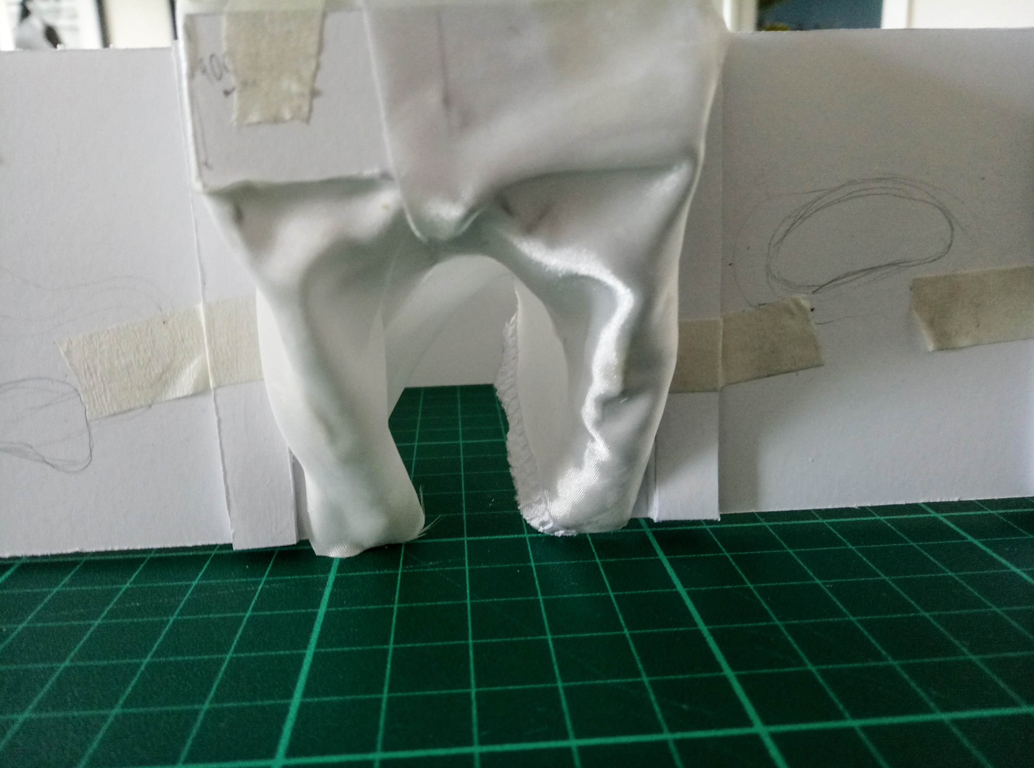
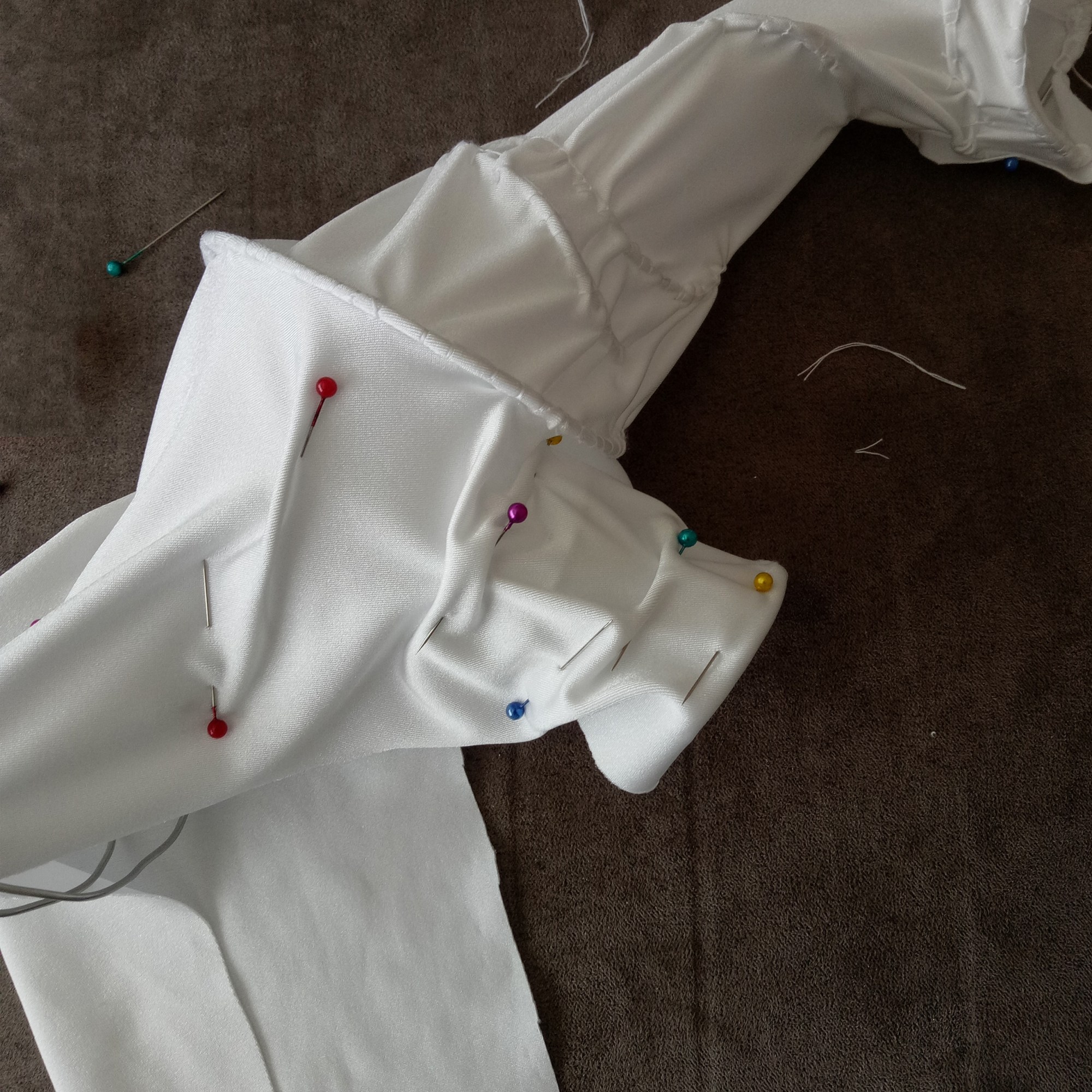
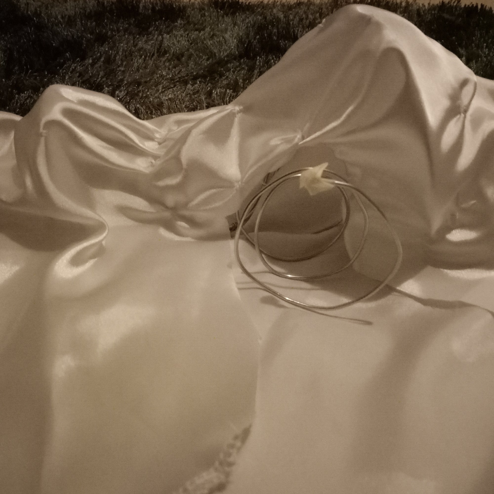
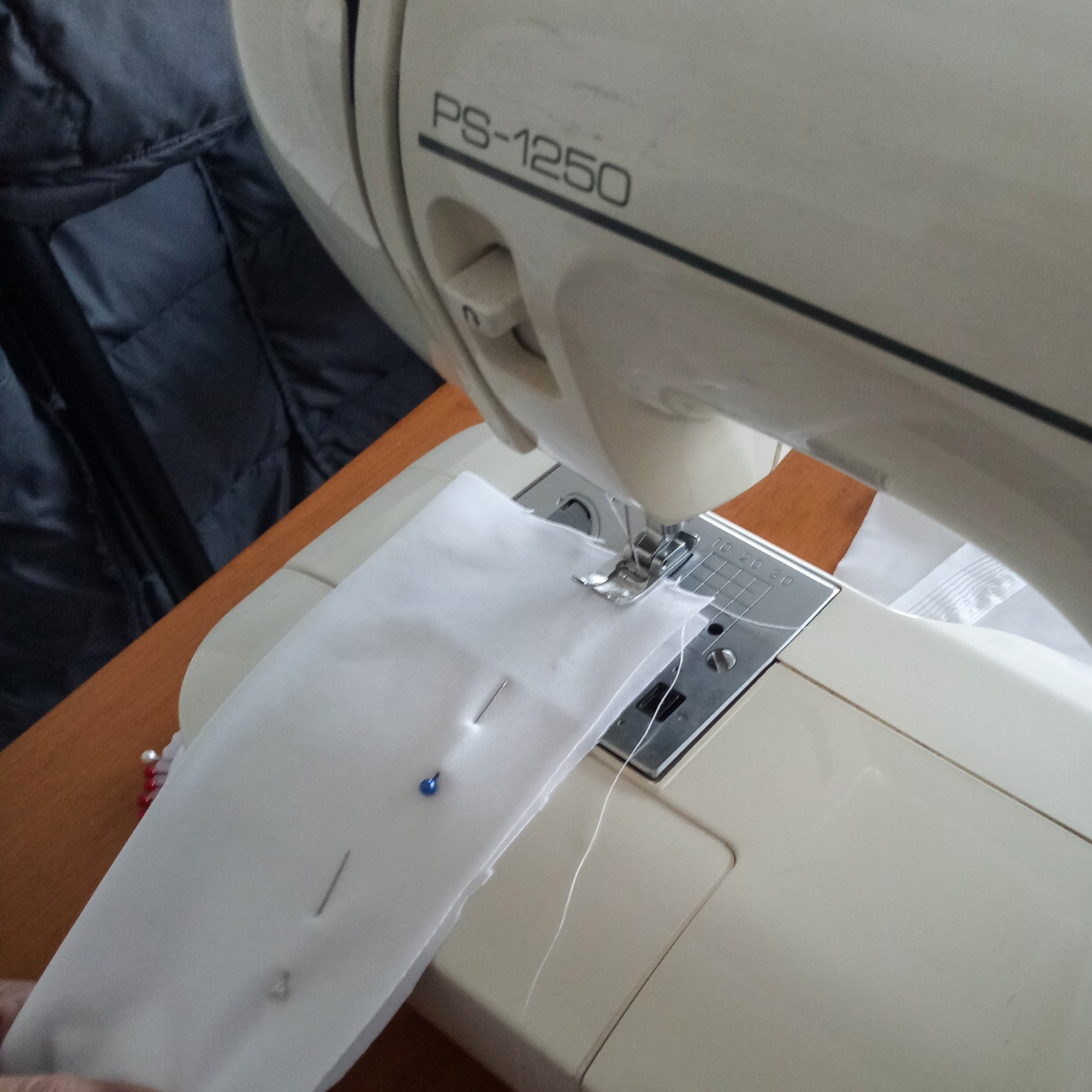
To finish the tunnel I wanted to cover it with fabric, I chose this material because it still allowed light to shine through it and I believed the fabric would bring to mind comfort as if inside a cocoon. I first used a white satin fabric but soon found out it was too rigid to curve with the spiral metal frame. I then tried a stretchy nylon fabric, this worked much better as it a lot more moldable. When deciding how best to cover the metal wires with the stretchy fabric I tested two methods. The first was making a uniform fabric sleeve that I could cover the spiral with. But when I tried to cover the metal the fabric would squash and deform the shape of the larger spirals. The second was simply sewing what I needed for each spiral this way the wires kept their shape and the tunnel showed more definition. In the end I chose the second method.
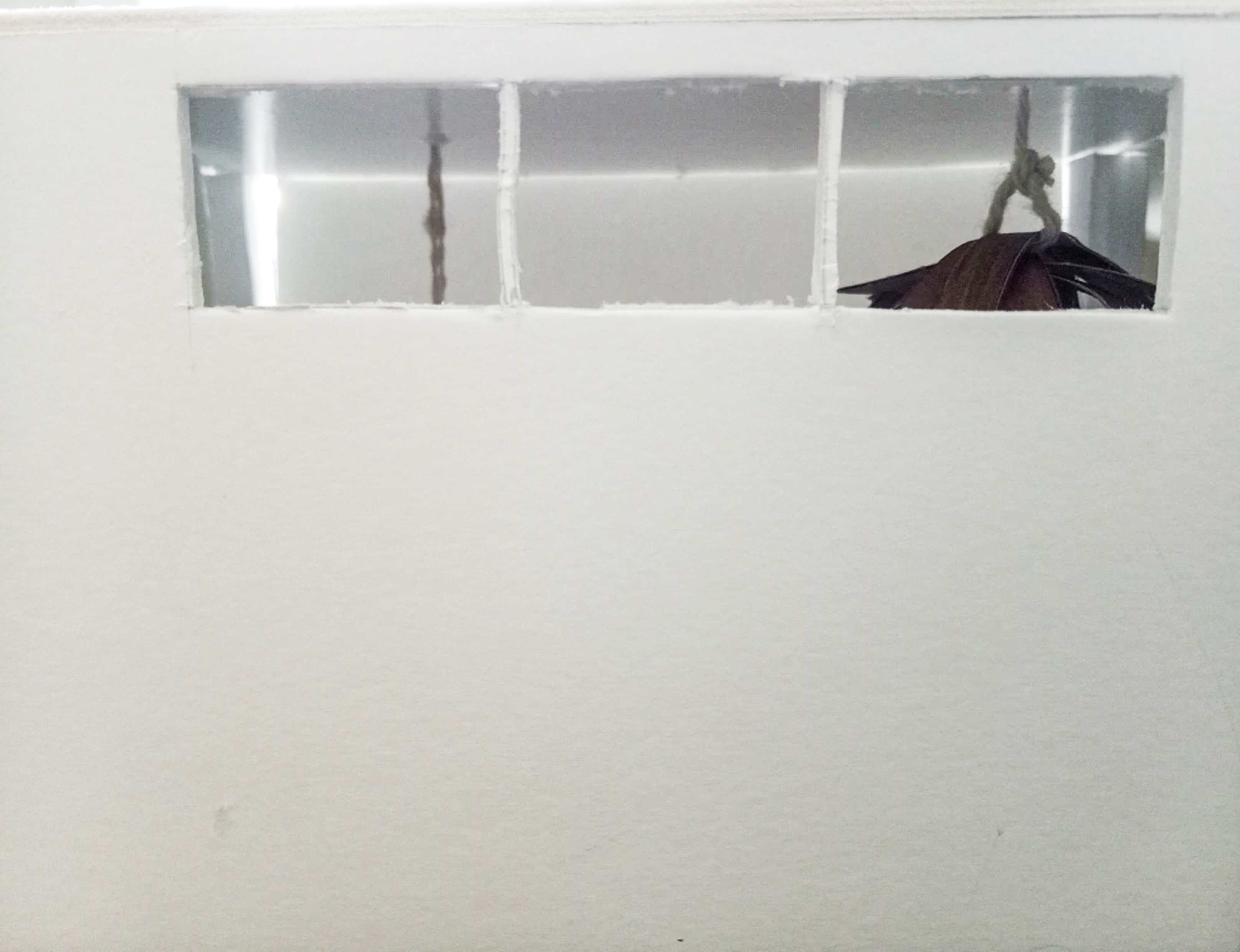
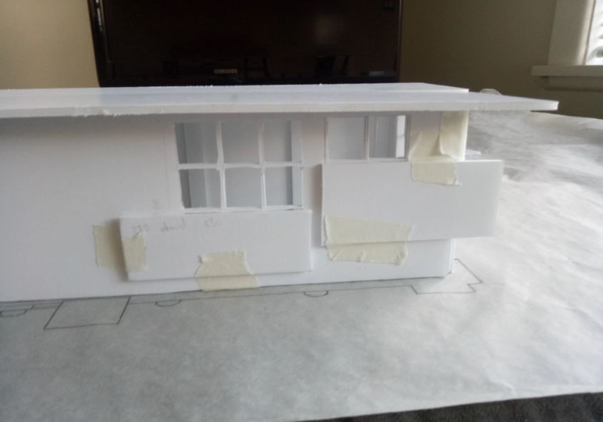
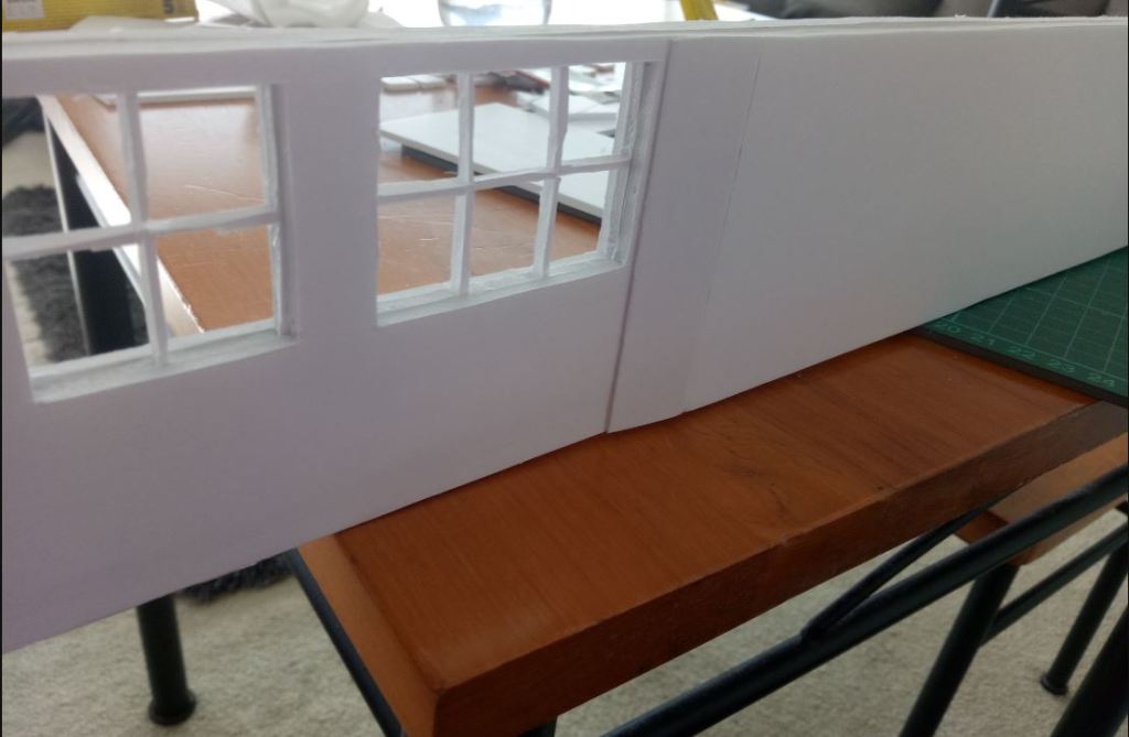
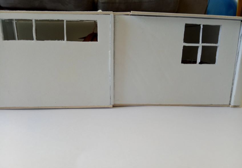
I then started to place my focus on the gallery site itself, I evaluated the fake additional wall already present in the gallery and started to test potential window frame sizes for that area. My main goal was to allow as much light to enter the gallery while still not having the gallery feel too exposed to the people outside the street. I wanted the natural light to travel and slowly fade as one descends to the back of the room.
The final window display mirrors the front of the gallery, this way the frames share a harmony and feel seamless to the space. Instead of having three columns of windows I opted for two columns each having three rows of window frames. This way people outside the gallery do not have a clear view of what is happening inside and it still allows for a large amount of sunlight to shine through the gallery room.
Because of the added windows, a small amount of the fake wall had to be removed. I did not want to remove the entire fake wall because it would leave exposed the existing columns that were covered. I wanted a delicate and seamless appearance so I made sure to connect the two different layered walls with an inclined wall.

Once the tunnel model was finished I drew the model on a piece of butter paper and placed it over the floor plan I had made. I needed to see how the tunnel model would influence the gallery space.
I also made sure there was only one entrance and one exit to the gallery because I wanted the entrance threshold to closely mirror my own sleeping state. Once someone enters the gallery they have the freedom to explore but once it was time leave the gallery there can only be one exit. The entrance and the exit are connected.
Developing the sleeping area
Half way through designing our projects we were asked to think of two people that would inhabit the gallery space. In preparation of having two strangers stay inside the gallery overnight, I began to sketch through many different sleeping platform ideas. It was important to me to design two separate sleeping platforms for each person, I wanted the sleeping area to feel safe and welcoming.
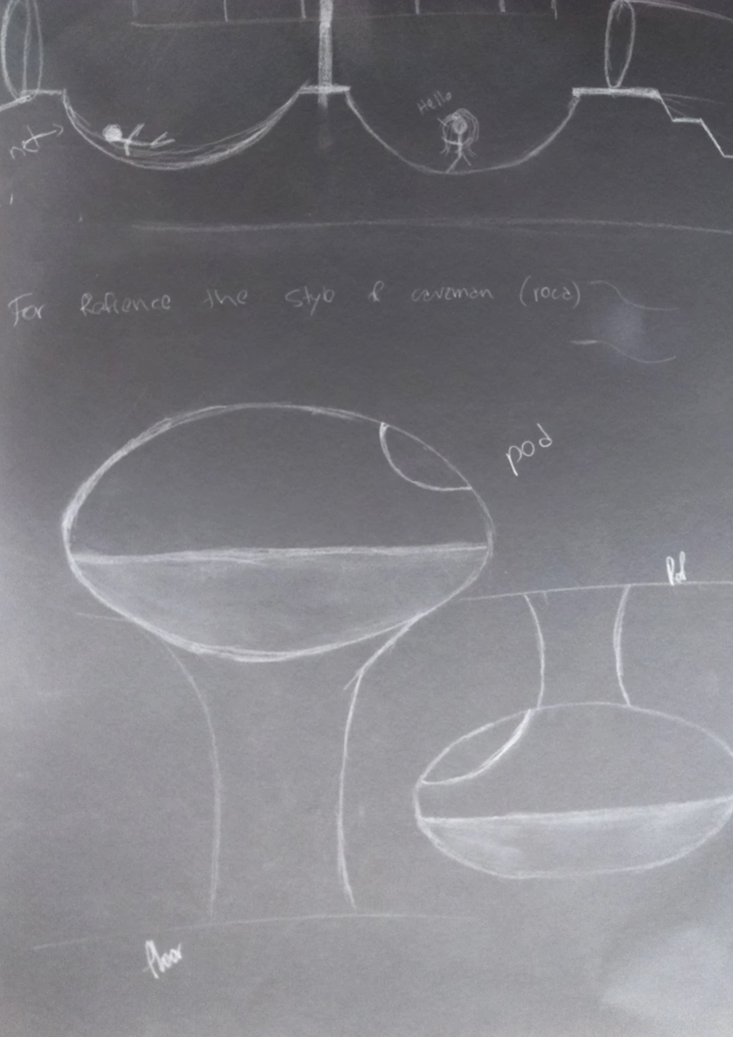
I decided to further develop the sketch with the sleeping pods and began to test potential pod shapes. I also began thinking of ways to elevate the sleeping pod platform. I thought of making the pods be held up by a spiral platform and also I tested having the pods elevated by having them hanging from the ceiling.
Finding the right material to cover the pods required some testing. I began by trying to cover the pod models with a satin white fabric but I found having both the sleeping pods and the tunnels be the same colour too overwhelming to the senses. I thought the pods needed to be made of a different material to bring a different texture to the space.
When I chose the main shape of the sleeping pods, the model with the multiple pieces of paper bent over one another, I needed to figure out what material to use for the model. I later found a project by architect Kengo Kuma in the GC Prostho Museum Research Center:

Kuma’s use of timber in this project was very unique, his continued layering of wood created depth to the room and the light entering into the museum gradually travelled through depending on the amount of wood layers a spot had.
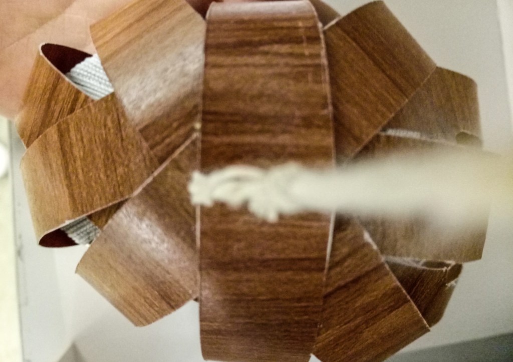
Inspired with Kuma’s work I decided to use timber to make the sleeping pods, making the curved flat strips be made of timber. I felt it would bring great warmness and a nest effect without anyone feeling claustrophobic.
Making the final sleeping pod model
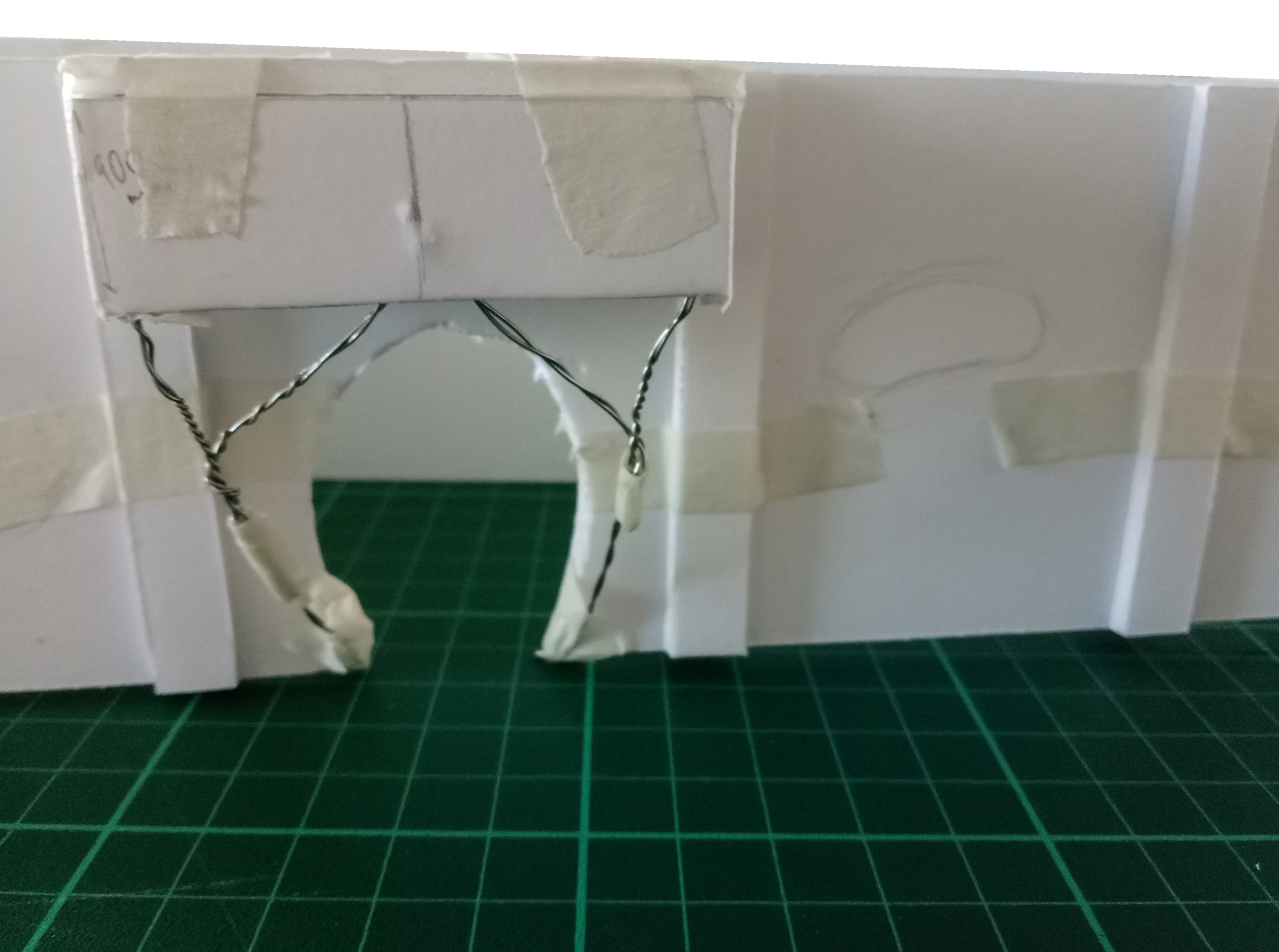
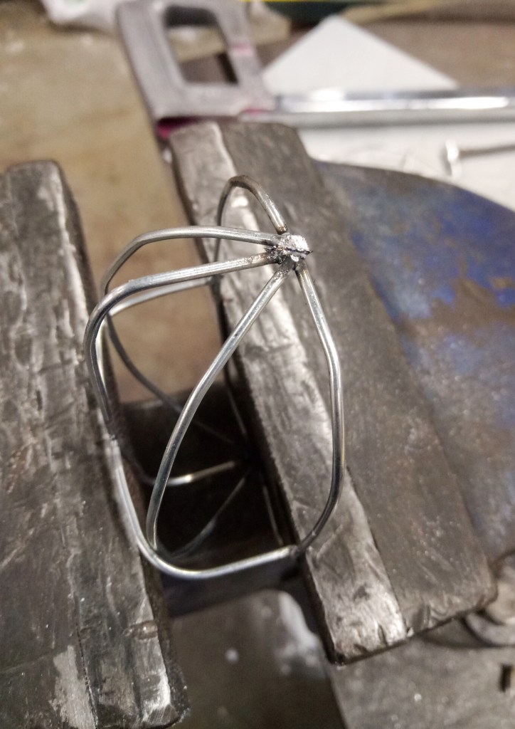
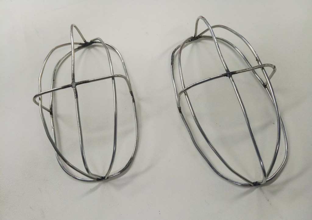
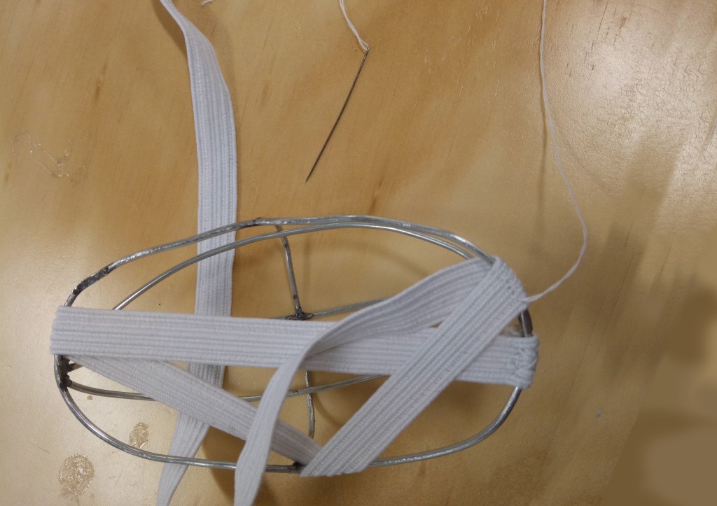
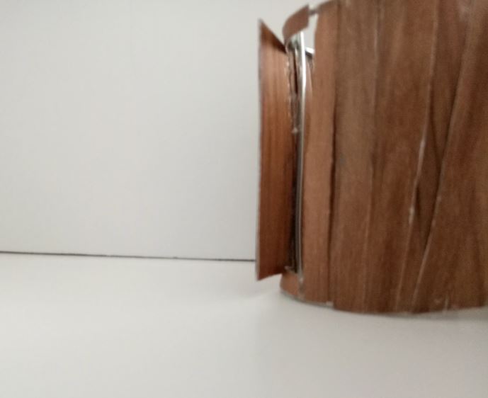
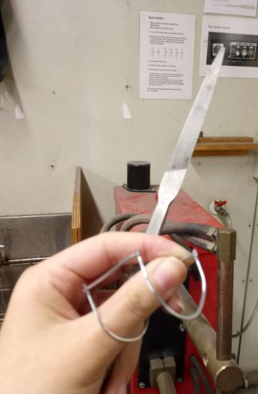
To make the sleeping pods I began by creating a metal base. I fashioned the size of the pods based on the average height of a person and built the rest of the pod around this base. To help the thin timber strips keep their round shape, I added a half metal dome to the metal outline. I used a spot welder to join the different parts of the metal.
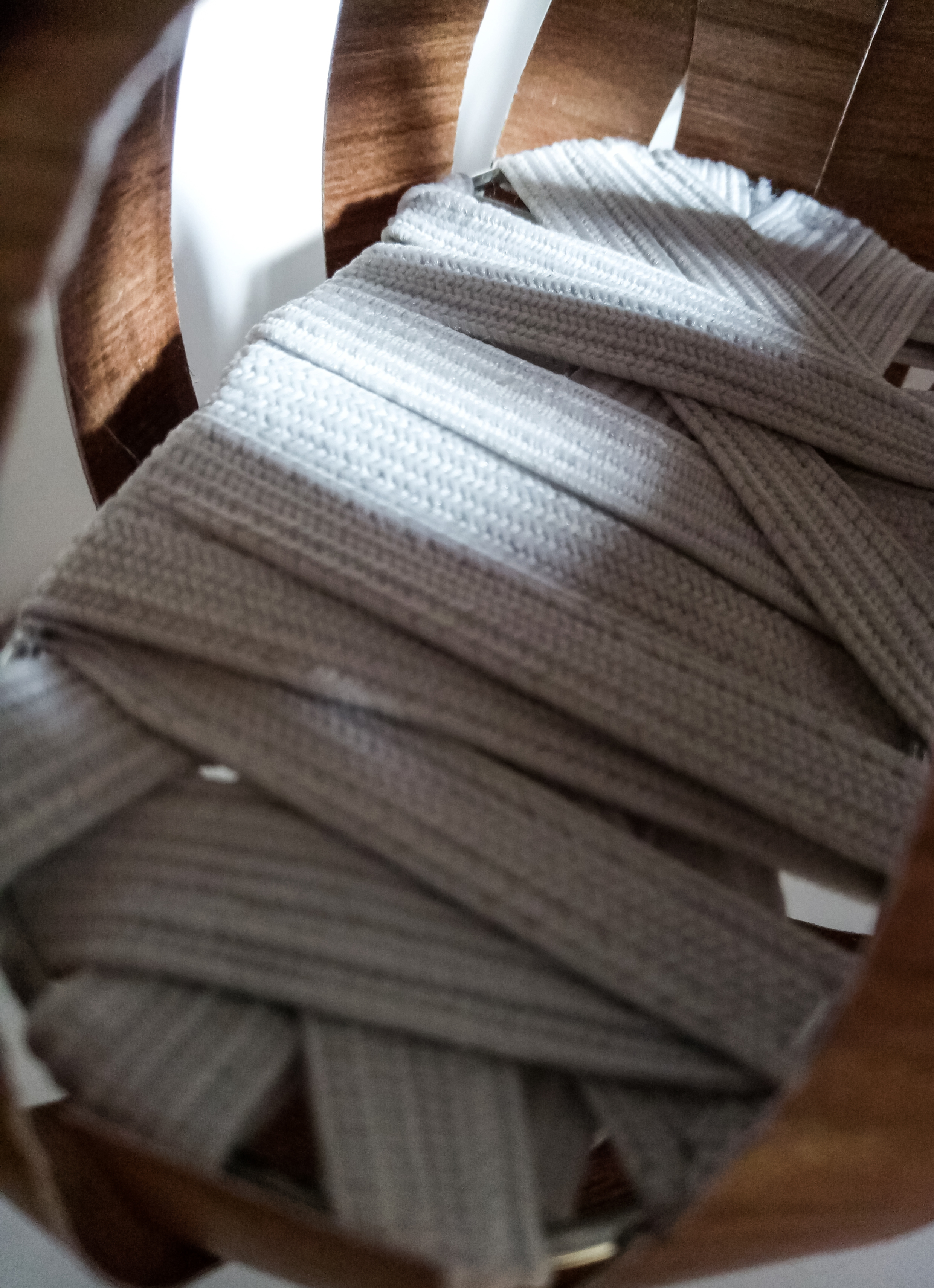
I then wrapped around the metal base with multiple layers of elastic strings and sewed them into place to secure them, this would become the ‘mattress’ of the pods. Although I am designing this project with legitimate functionality, I am creating 1:20 and 1:50 size models of the pods and tunnels and am substituting some of the mechanical gadgets to techniques that will help me make the same sized models.
With this in mind I used thick paper and printed the texture of wood on it. I glued these together and made strips of to curve around the metal base. To reinforce the wooden strips so the paper wouldn’t rip I placed a plastic strip around one of the timber pieces, this way the rope I used to attach the pods to the ceiling would not create so much tension on the strips of wood when I suspended the pods on the air.

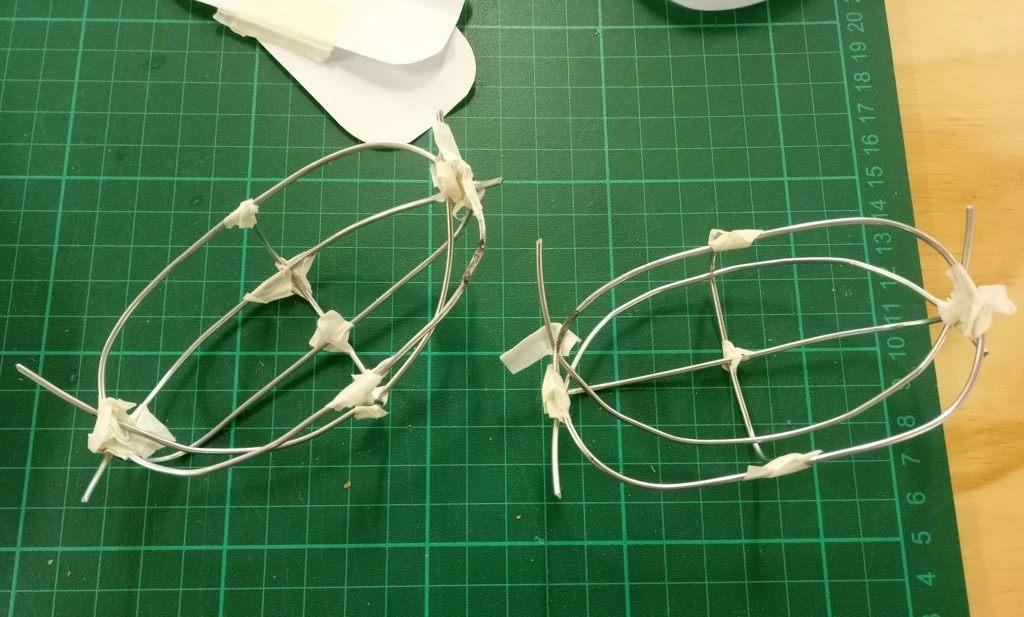

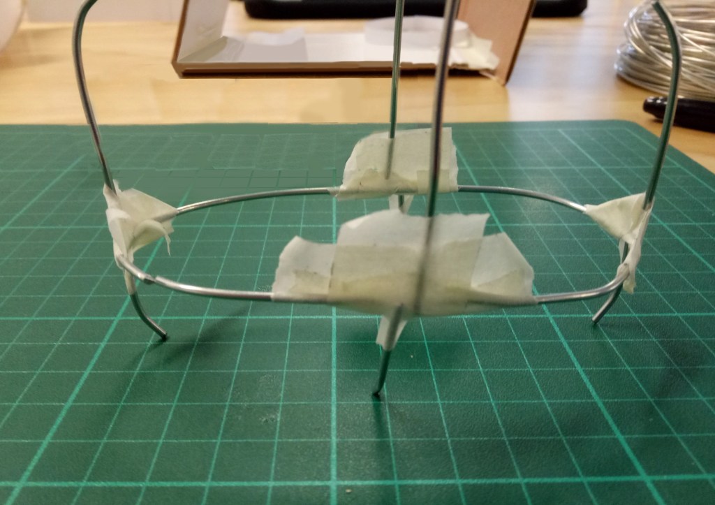


To keep both sleeping pods elevated from the ground, I knew the pods would need the roof to be reinforced with a sturdy hook system and a simpler technique would be needed for the ground floor.
For the sake of making the pods model function as best as possible I made a small hole on the roof and floor allowing the rope through and tied a knot outside of the foam board to keep everything in place.
Re-developing the tunnel system


When I decided that the two strangers staying inside the gallery space would be musicians. I wanted to add a sound proof area (with foam) inside an area of the entrance threshold (tunnel). Because of this I opened up the fabric covering the tunnel and reshaped it to fit the foam. I then re-sewed the fabric over the framework. I wanted to give the musicians access to a space with a different sound quality and believed this was the best way to achieve it.

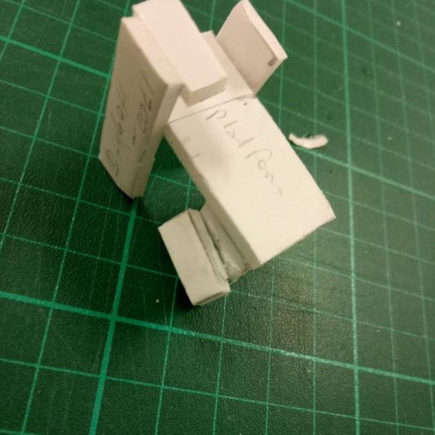
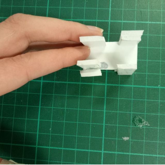
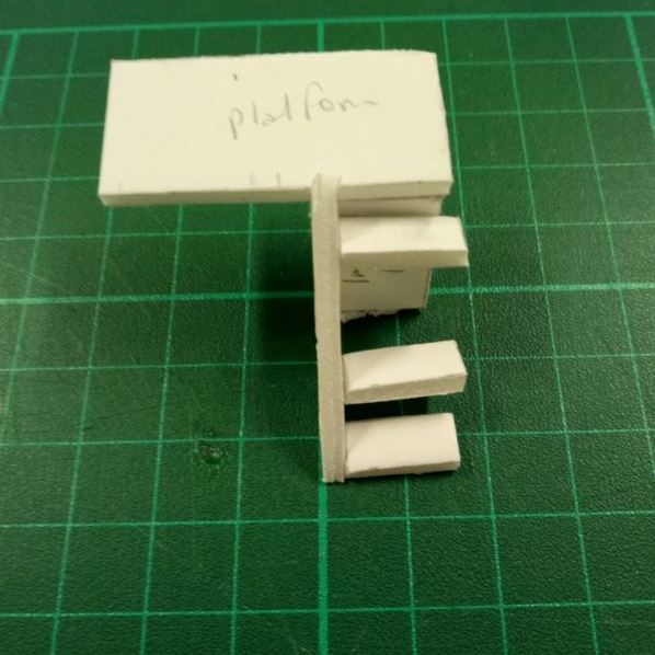
I made a stair platform to allow the two musicians easy access to the sleeping pods. I measured the height of each pod once they were elevated and measured the distance between them to know how big the platform needed to be. I supported the main platform with 4 legs keeping the shape of the platform narrow and provide a tall safety barrier for the top stairs.
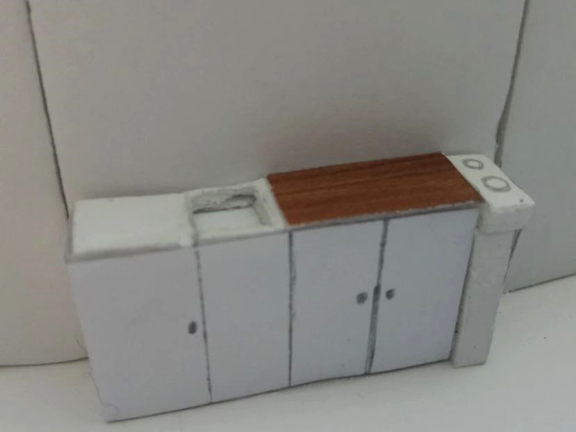
Below are the everyday furniture essentials for a living space: Kitchen, dining table, bathroom. I wanted the bathroom to share similarities with the sleeping pods and keep the same material palette for the bathroom. I welded together a half metal dome structure and layered thin strips of wood around it while keeping room for a door entrance.
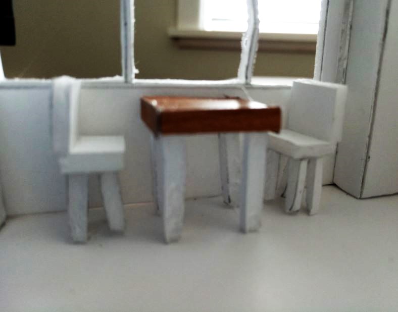
When making the kitchen and the eating area, I used the furniture in my own home as measurement references for the dinning table and kitchen. I purposefully wanted the kitchen and dinning area to be simple, since I did not want them to be paid much attention to. The main focus of the gallery are the entrance tunnels and the sleeping pods. All the elements that the two musicians had to use contained timber, timber become the link between the furniture.

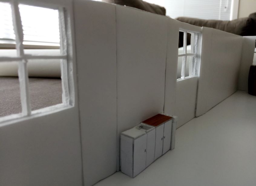
The final changes I made to my project were the additional carved windows. I began to notice the gallery space was getting too dark inside and needed some extra outside light to help illuminate the bathroom kitchen and sleeping pods. I added a total of 3 sets of new windows, all of which were positioned high enough that people walking outside on the street could not see the people inside the gallery.
When I added an extra set of windows on the main side wall where the fake wall is, I opted to use the same fake wall removing technique I had used on the first sets of windows.

Leave a comment